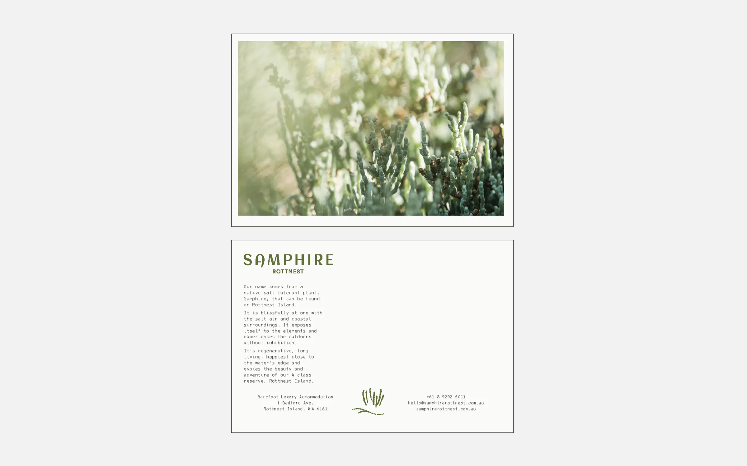
Samphire Rottnest
Style Guide
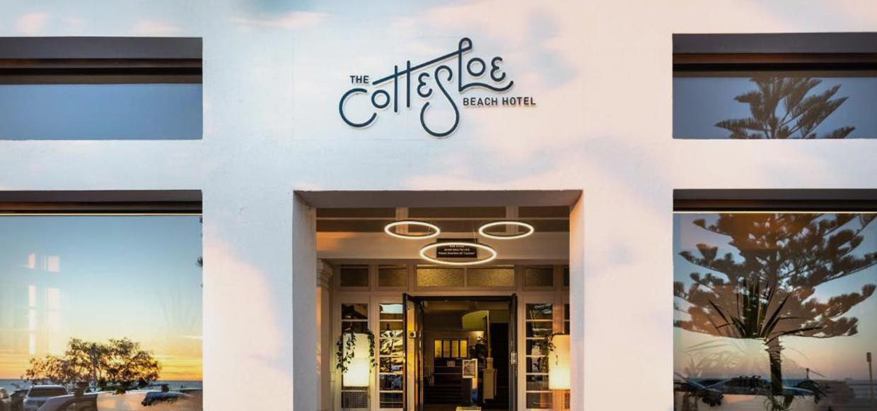
Mission & Vision
At Samphire Rottnest we pride ourselves on providing our guests everything they need to live in the moment and enjoy the best of the island life.
The chance to feel the sand between their toes, the salt on their skin and to discover the unique beauty of Rottnest Island. We want them to create lasting memories and let the distractions of the world slip away. Guests are encouraged to explore the island whether by boat, bike or foot or simply relax and enjoy the unique hotel experiences right at their doorstep. At Samphire Rottnest their enjoyment should be effortless, their needs anticipated.
Elevator Pitch
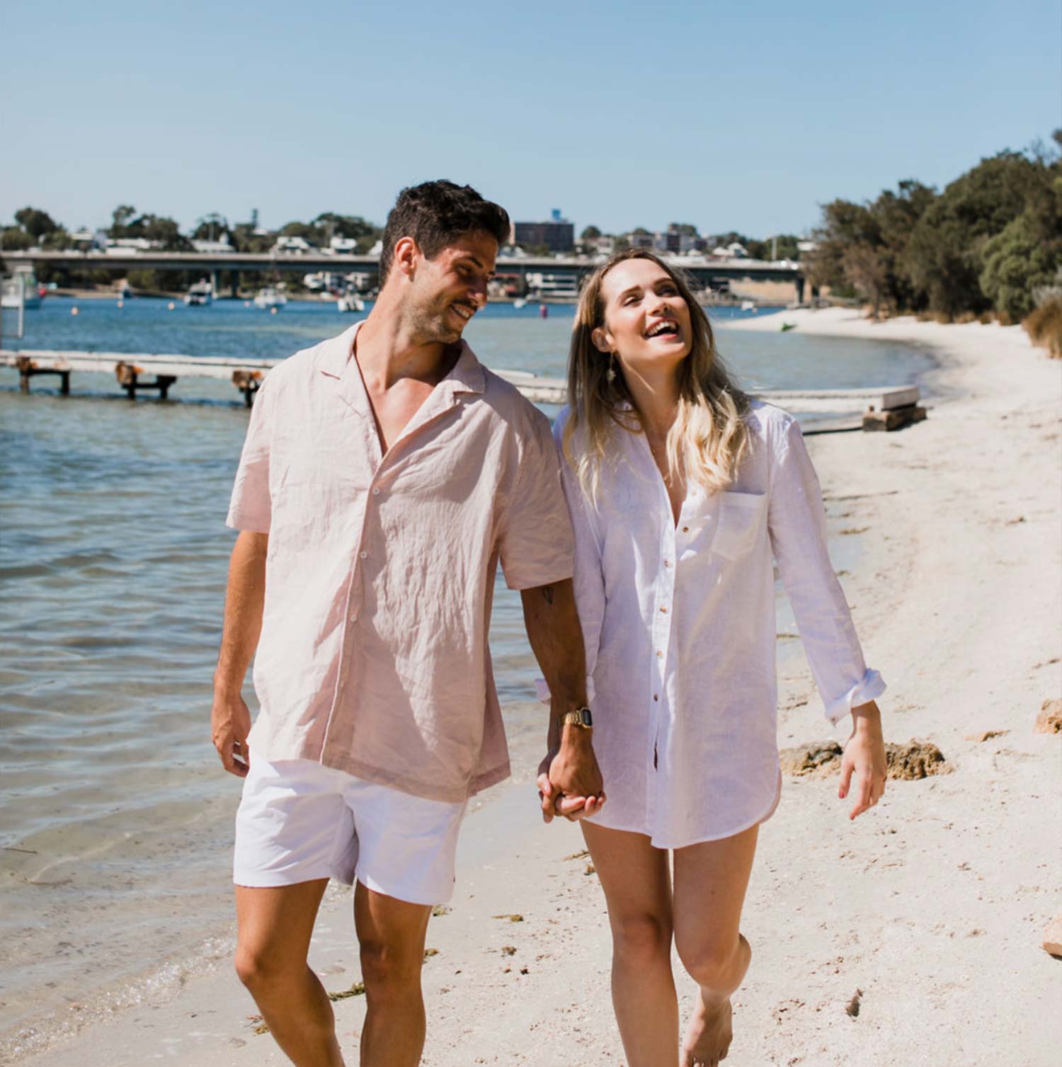
Explore, relax and celebrate on one of Australia’s most unique island settings.
Personality
Tone Of Voice
Our preferred tone of voice for Samphire Rottnest is:
Welcoming, natural, warm, informal, friendly, non-corporate.
It should reflect the experience guests have at Samphire Rottnest and on the island in general. Think sunny, relaxed, carefree. Print communications should have personality and not be overly polished.All copy should be inclusive rather than exclusive, and approachable rather than pretentious.
Communicate in ways that are knowledgeable but not know-it-all. Be an expert on the destination but never speak over people’s heads.Be inclusive but not generic. Everyone should feel as though they’re welcome at Samphire Rottnest, but that the experience is one of a kind.
At all times the tone should be welcoming, upbeat, helpful, positive and trustworthy, like an outgoing local friend who is always ready to offer recommendations on the hotel and Rottnest Island based on personal experience and insights.
Keep things simple wherever possible.
Use ‘we’ in relation to Samphire Rottnest and ‘you’ in relation to guests. Avoid exclamation marks – the writing should be impactful without them. Capitalisation should be confined to names and brands.
Online
When creating content for the online channels, such as Instagram and Facebook, follow the Print Guidelines, but take the following into account as well.
Focus on emotions, rather than things. The content should express the value and quality of SamphireRottnest, and cater to the visitor’s desire for experiences that create lasting memories.
Have a perspective. Facts are important, but travel is personal. You know Samphire Rottnest, but blend in personality and a fresh perspective. Anyone reading the content should be able to see themselves as part of the story.
Speak to the reader and say it with feeling. Write like you speak, and speak directly to the reader with personal pronouns like “you”. Like one traveller talking to another, you want to sound as though you’re telling a good friend about your personal experience atSamphire Rottnest, exactly as you felt it.
Show, don’t tell. Paint a picture of the destination and the experience. Focus on specific examples rather than broad generalisations.
Use the content to allow readers to discover new experiences. Show them a side of SamphireRottnest and Rottnest Island they may not be familiar with.
Have fun with the content. Make people want to be part of the Samphire Rottnest club.
Master Logo
This is the official Masterbrand for Samphire Rottnest. The arrangement of the typography combines as a unit to form the Masterbrand.

Master Logo Variants
The master logo come in multiple approved colour variants


Brand Mark
An additional brand device that can aid with layouts and communication is the Samphire Rottnest Brand Icon.
Contrast should be at the forefront of the designers mind to maintain legibility. This icon should be used selectively and used to support (not replace) the masterbrand.

Brand Mark Variants
The brand mark comes in multiple approved colour variants.


Incorrect use
Illustrated on this page are a number of common mistakes when implementing the Masterbrand.
Protecting the Sasmphire Rottnest Masterbrand means always ensuring that it is represented consistently and accurately, in accordance with this style guide.

The Samphire Rottnest brandmark should never be placed on an angle.
The Samphire Rottnest brandmark should never be stretched or warped to achieve specific proportions.
The Samphire Rottnest brandmark should never have the proportion of its elements adjusted.

The Samphire Rottnest brandmark should never re-typed with an alternate typeface.

The Samphire Rottnest brandmark should never be reproduced in a colour that is outside the brand colour palette.
The Samphire Rottnest brandmark should never filled with a texture or outlined.
Files
Please click on your preferred card to download a file.
Typefaces
To achieve consistency across all applications of the Samphire Rottnest brand, the font families in on this page should be used.
If web/digital fonts are required, please use the font Arial which is a freely available web-friendly typeface.

Highlight text, headings and main body copy

Informal heading, texts, captions, footers

Wayfinding and location signage font
Files
Please click on your preferred card to download a file.
Primary Palette
Colour re-production is of utmost importance when representing Samphire Rottnest.
A breakdown of these colours and their corresponding PMS, CMYK, RGB and HEX colours can be found here.
Secondary Palette
Colour re-production is of utmost importance when representing Samphire Rottnest.
A breakdown of these colours and their corresponding PMS, CMYK, RGB and HEX colours can be found here.
Tertiary Palette
Colour re-production is of utmost importance when representing Samphire Rottnest.
A breakdown of these colours and their corresponding PMS, CMYK, RGB and HEX colours can be found here.
Combinations
- Most common presentation is ‘Samphire’ green logo on ‘Limestone’ background.
- Second Most Common
- Other
- Other
Files
Please click on your preferred card to download a file. If you can't find what you're looking for please email us.
Style
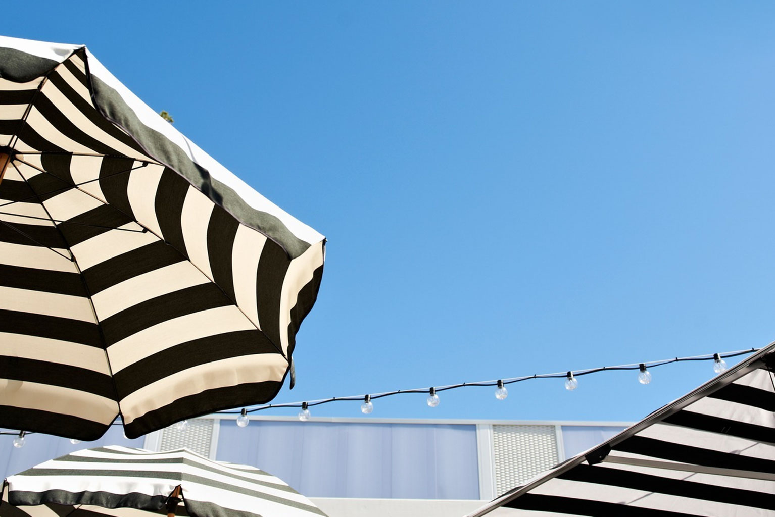
Highlighting: Beachfront Location, Pool, Relaxation, Boutique
Colours: Muted colours, featuring natural tones and light to embrace the idyllic Rottnest Island.


Files
Please click on your preferred card to download a file. If you can't find what you're looking for please email us.
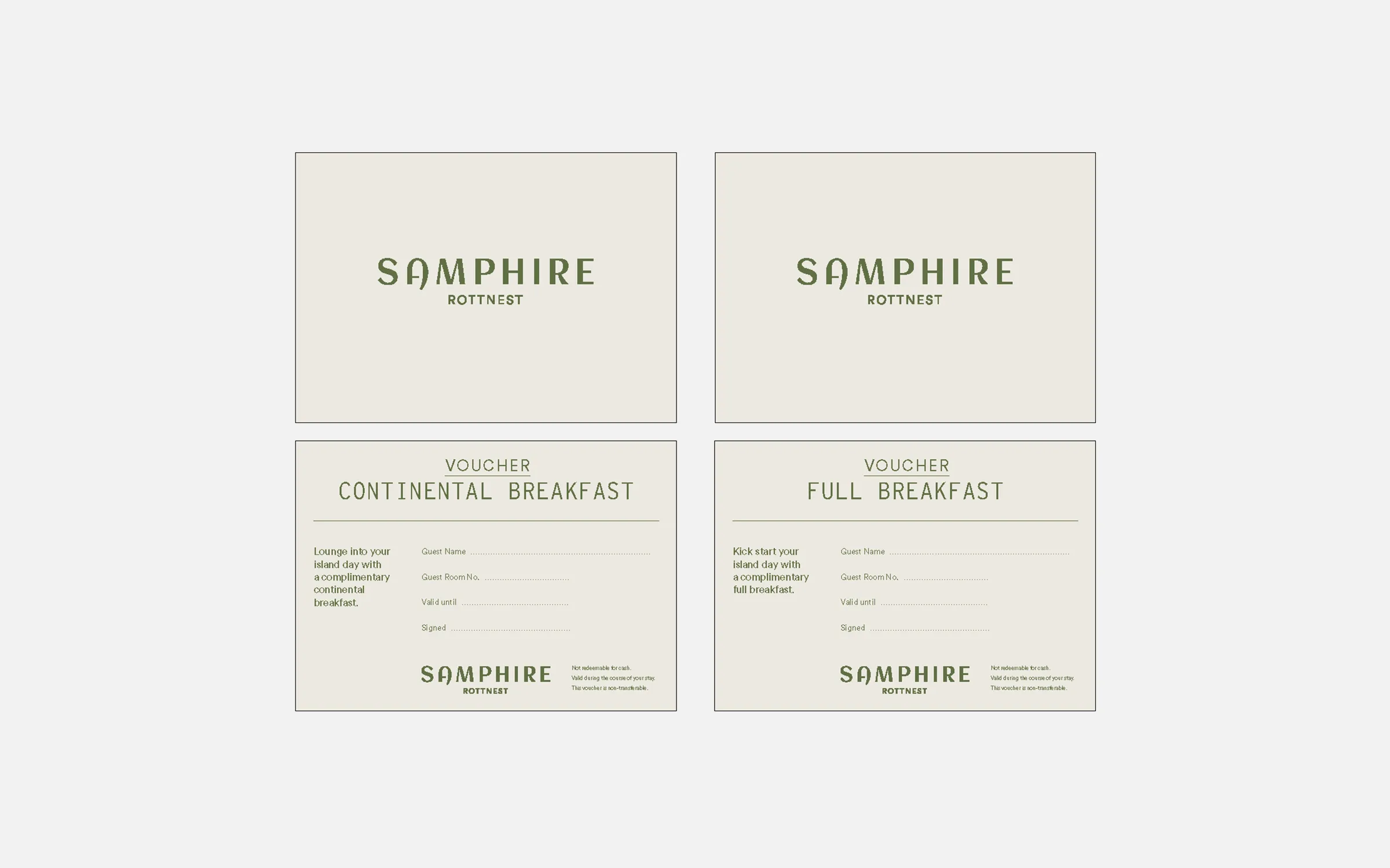
Business Card
- Size: 90mmx55mm
- Stock: 324gsm Neenah Classic Eggshell
- Colour: PMS 405 & PMS 575

With Compliments
- Size: 210mmx99mm
- Stock: 148gsm Neenah Classic Eggshell
- Colour: PMS 405 & PMS 575

Key Holder Whats on guide
- Size: 180mmx150mm
- Stock: 148gsm Knight White Vellum CMYK
- Finish: Score only
- Item Print: Items overprinted internally

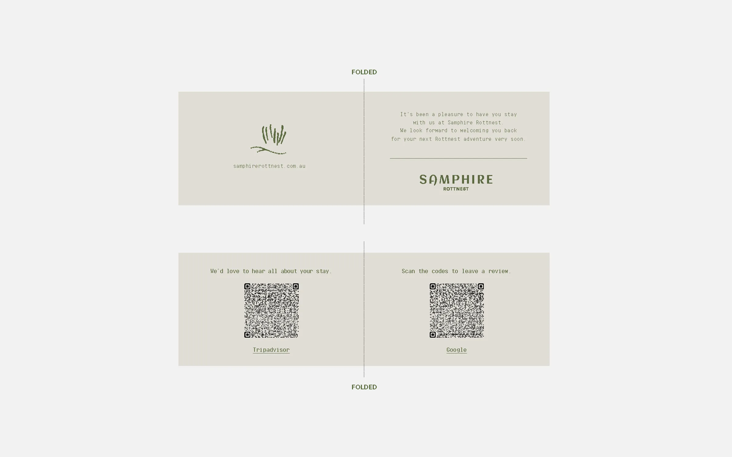
Welcome Card
- Size: 148mmx210mm
- Stock: 340gsm Knight White Vellum
- Colour: PMS 405 & PMS 575
- Finishing: Score & Fold
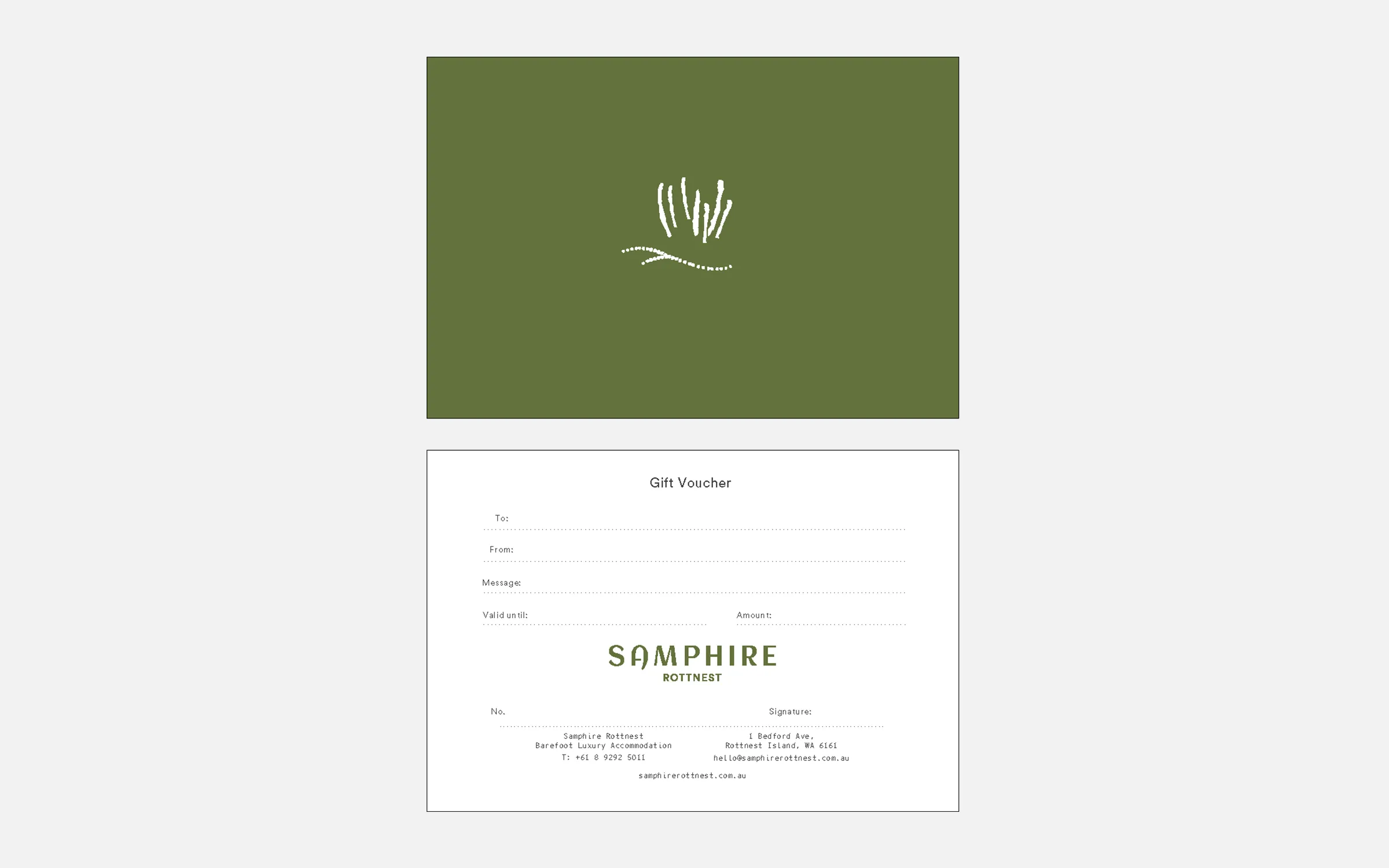
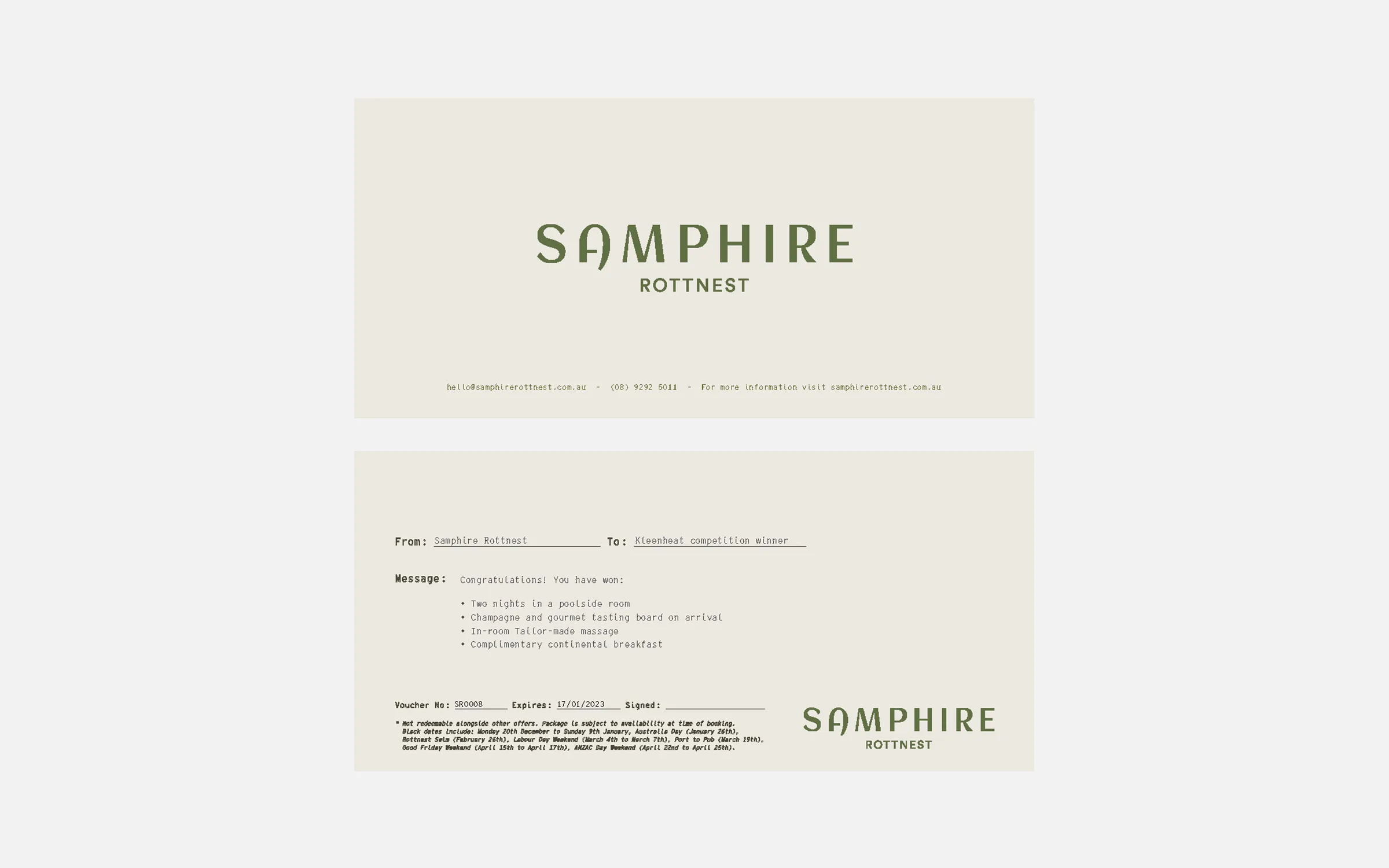
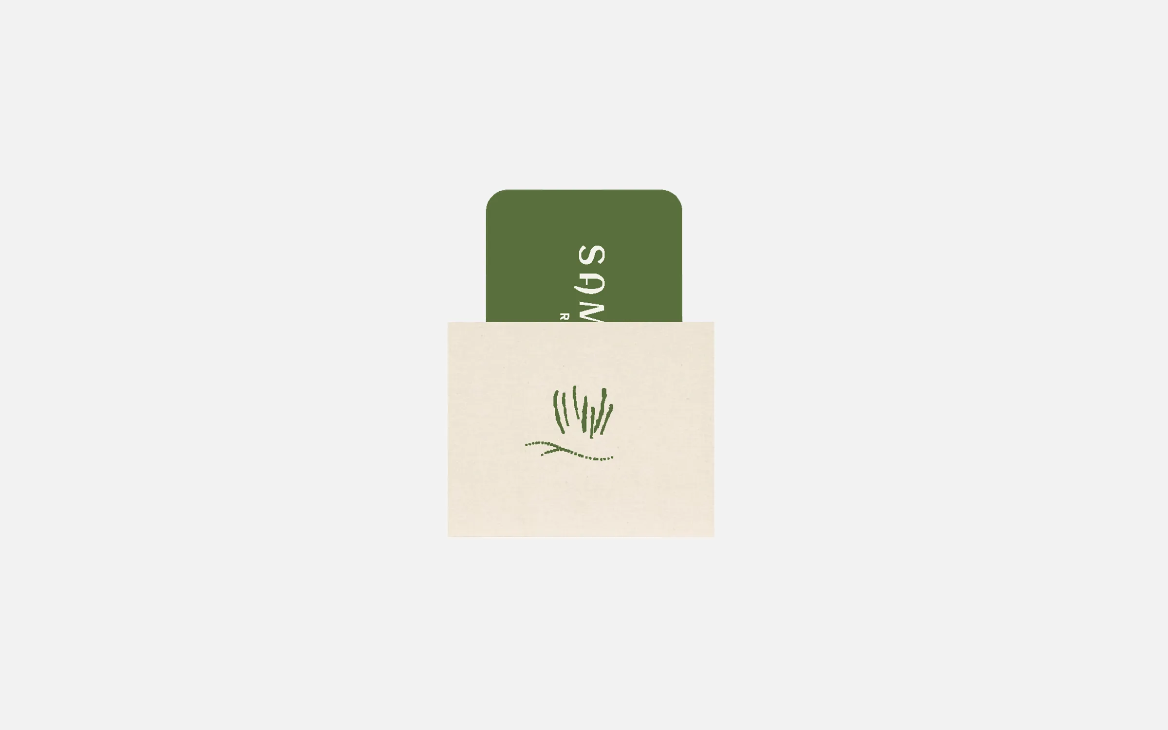
Gift Voucher
- Size: 180mmx120mm
- Stock: 324gsm Neenah Classic Eggshell
- Colour: PMS 405 & PMS 575
Note Pad
- Size: 105mmx148mm
- Stock: 100gsm Revive Laser
- Colour: PMS 405 & PMS 575
- Finishing: Pads of 10

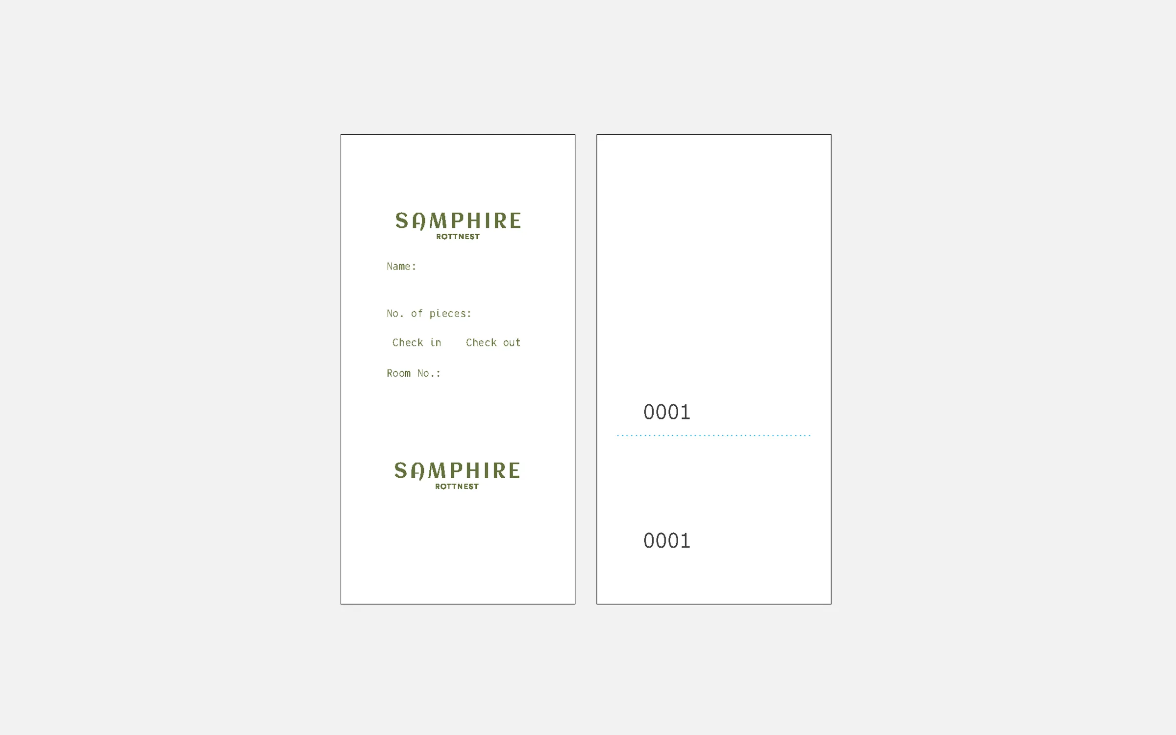
Luggage Tags
- Size: 50mmx120mm
- Stock: 270gsm Neenah Environment
- Colour: CMYK
- Finishing: Drilled, Perforated, Numbered, Twine
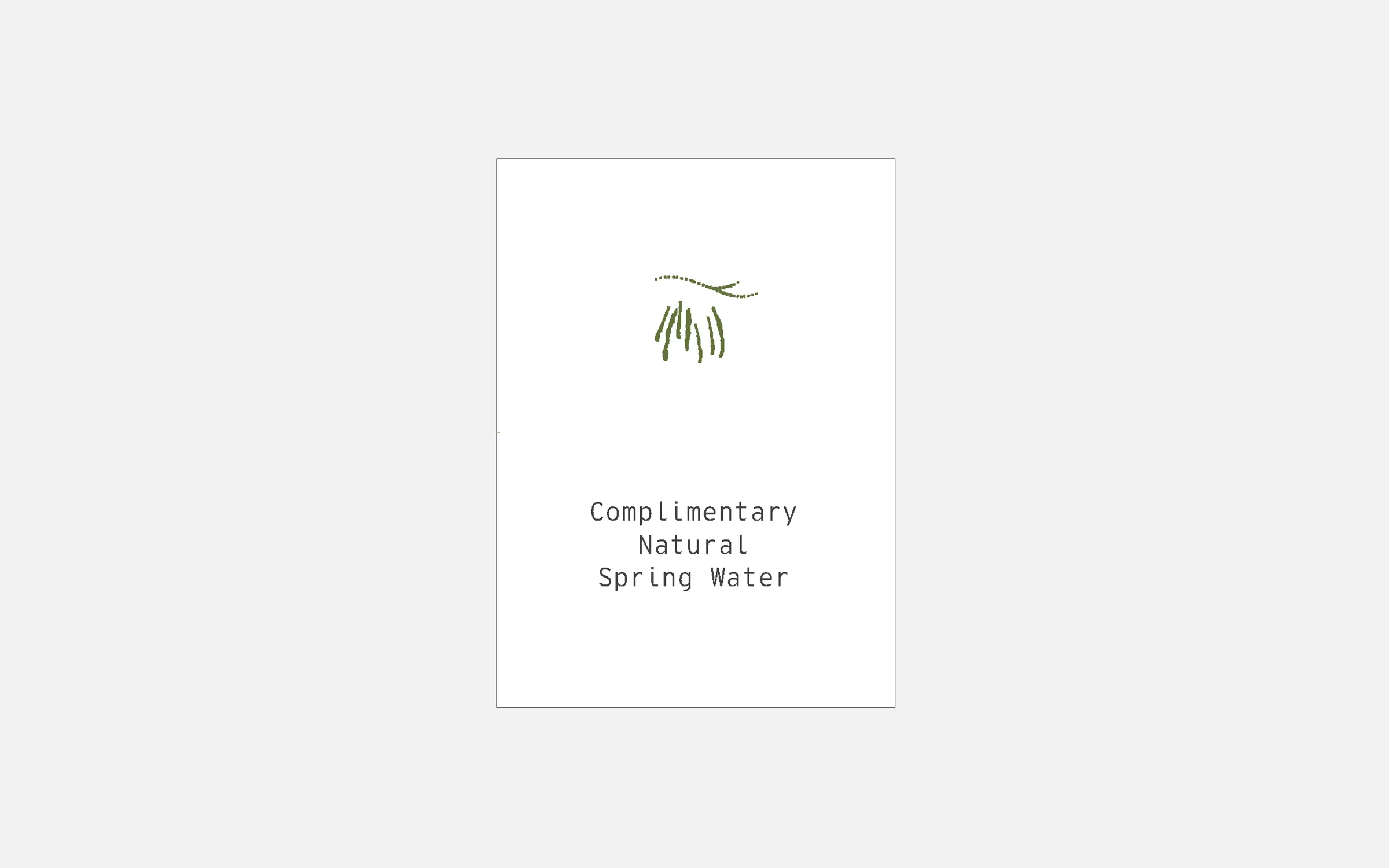
Complimentary Water
- Size: 45mmx80mm
- Stock: 270gsm Neenah Environment
- Colour: CMYK
- Finishing: Drilled, Twine

Folded Map
- Size: 297mmx180mm
- Stock: 140gsm Knight White Vellum
- Colour: CMYK
- Finishing: Score & Fold

Complimentary water
- Size: 88mmx110mm
- Stock: 270gsm Neenah Environment
- Colour: CMYK
- Finishing: Score & Fold
Review Cards
- Size: 180mmx55mm
- Stock: 324gsm Neenah Classic Eggshell
- Colour: CMYK
- Finishing: Score & Fold
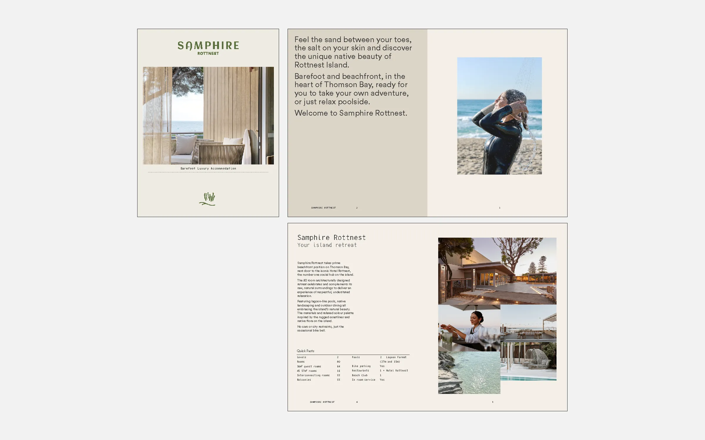
Overview brochure
- Size: A4 (16pp)
- Stock: Cover - 140gsm Pacesetter Laser
Internal - 100gsm Pacesetter Laser
- Colour: CMYK
- Finishing: Bound
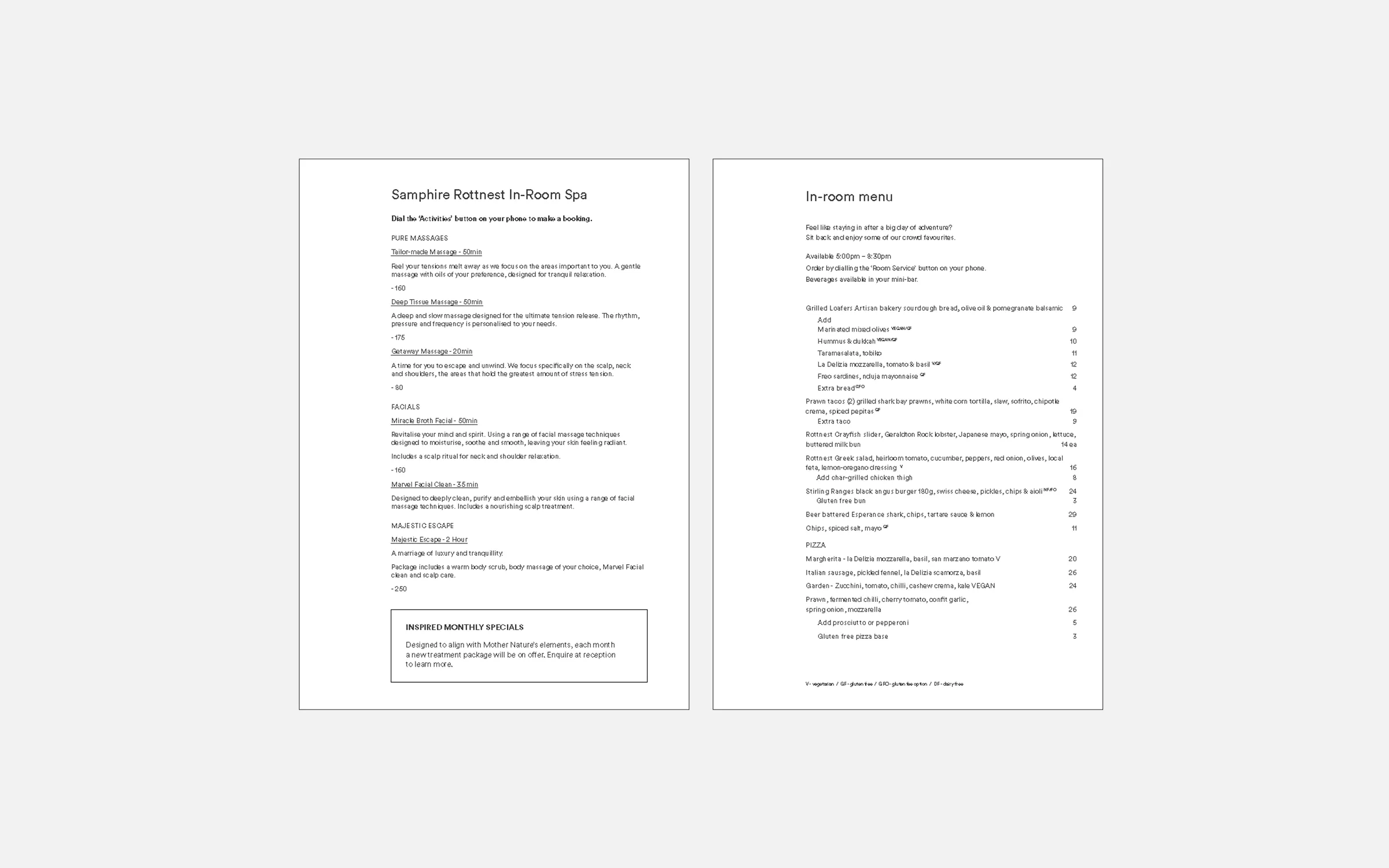
Massage menu
- Size: 150mmx150mm
- Stock: 200gsm Pacesetter
- Colour: Laser CMYK
- Finishing Score & Fold

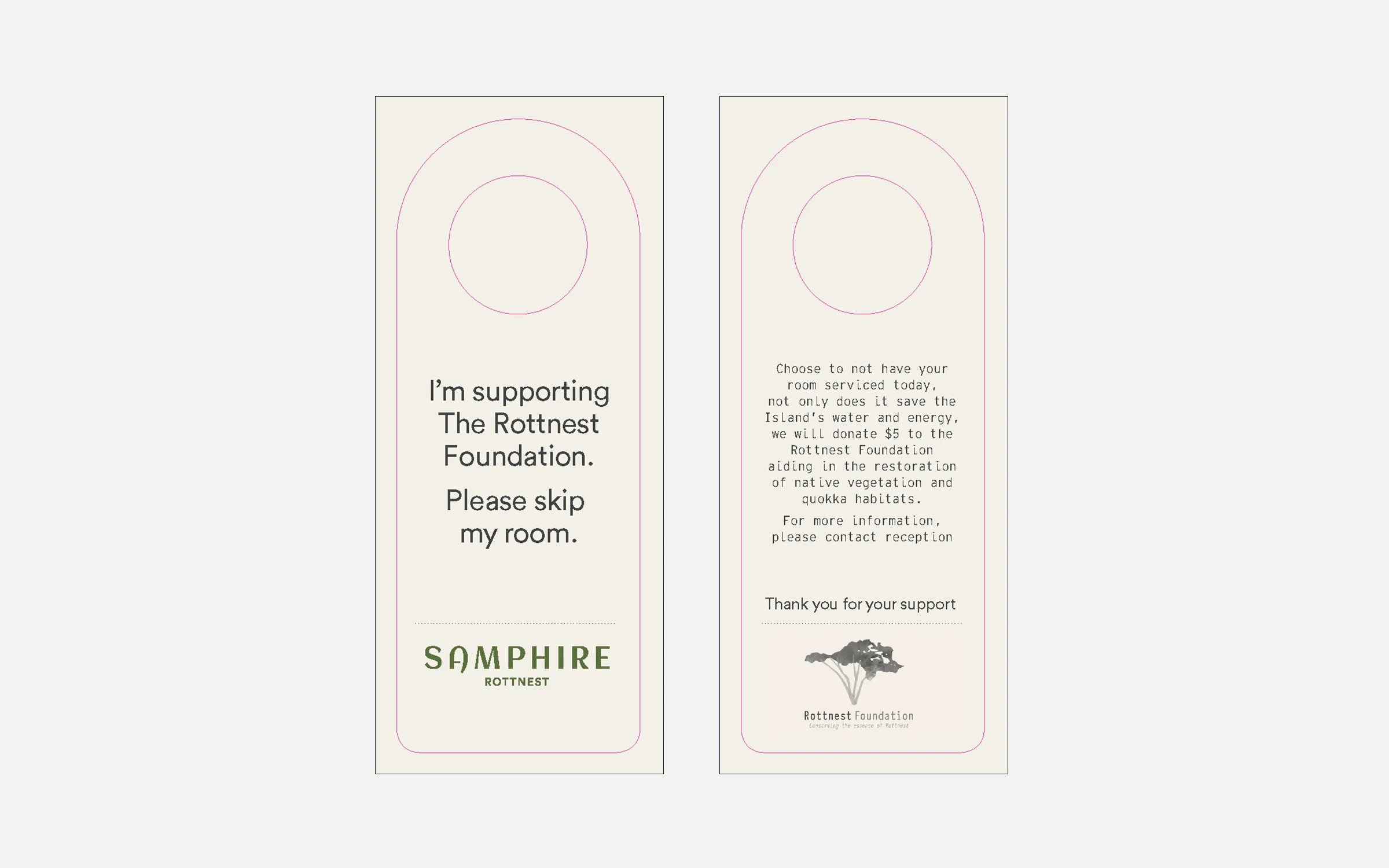
Eco Door Hanger
- Size: As per dieline
- Stock: 325gsm Knight White Vellum
- Colour: CMYK
- Finishing: Diecut
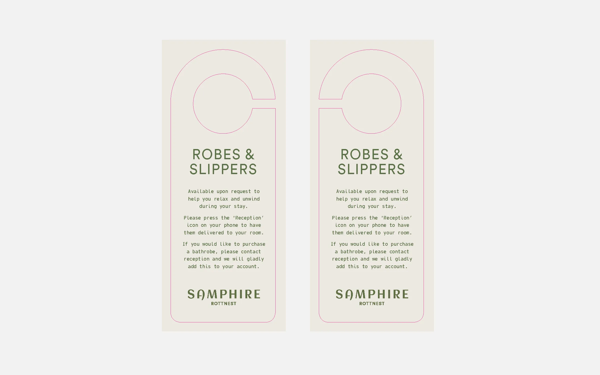
Robes & slippers hanger
- Size: As per dieline
- Stock: 325gsm Knight White Vellum
- Colour: CMYK
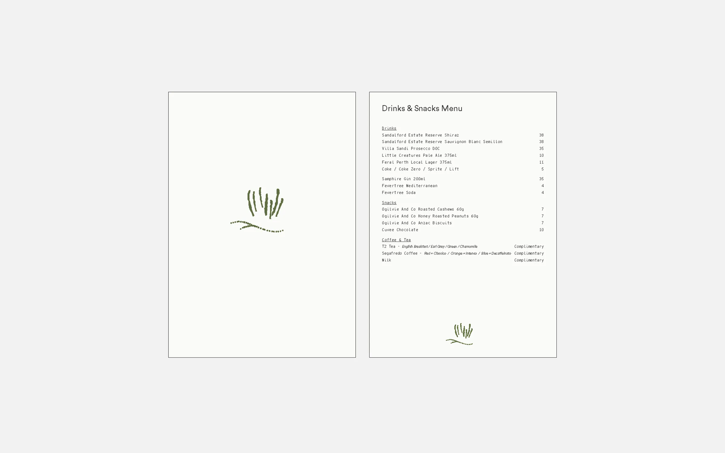
Drinks & Snacks Menu
- Size: 148mmx210mm
- Stock: 200gsm Pacesetter Laser (Blank Sheets)
- Colour: CMYK
- Item Print: Text printed internally
Comendium Internal Pages
- Size: A4
- Stock: 200gsm Pacesetter Laser (Blank Sheets) Black
- Item Print: Text printed internally
- Finish: Drilled, Edge Scored

Drawstring bag
- Item Code: Printer To Advise
- Size: Printer To Advise
- Material: Calico
- Colour: Tote - Natural Calico
Brand - PMS 575

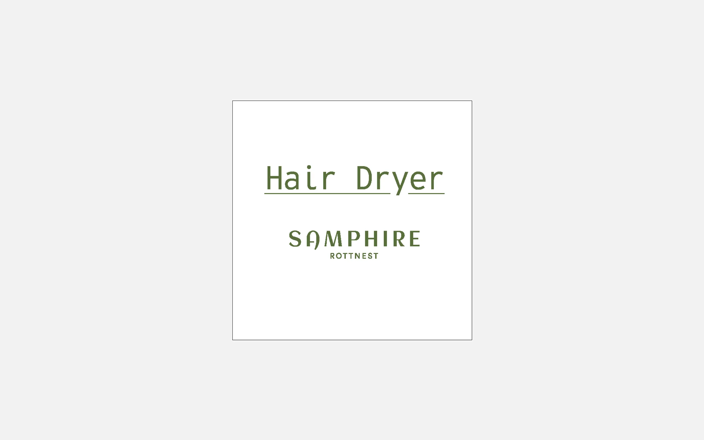
Hair Dryer Bag
- Item Code: Printer To Advise
- Size: Printer To Advise
- Material: Calico
- Colour: Tote - Natural Calico
Brand - PMS 575
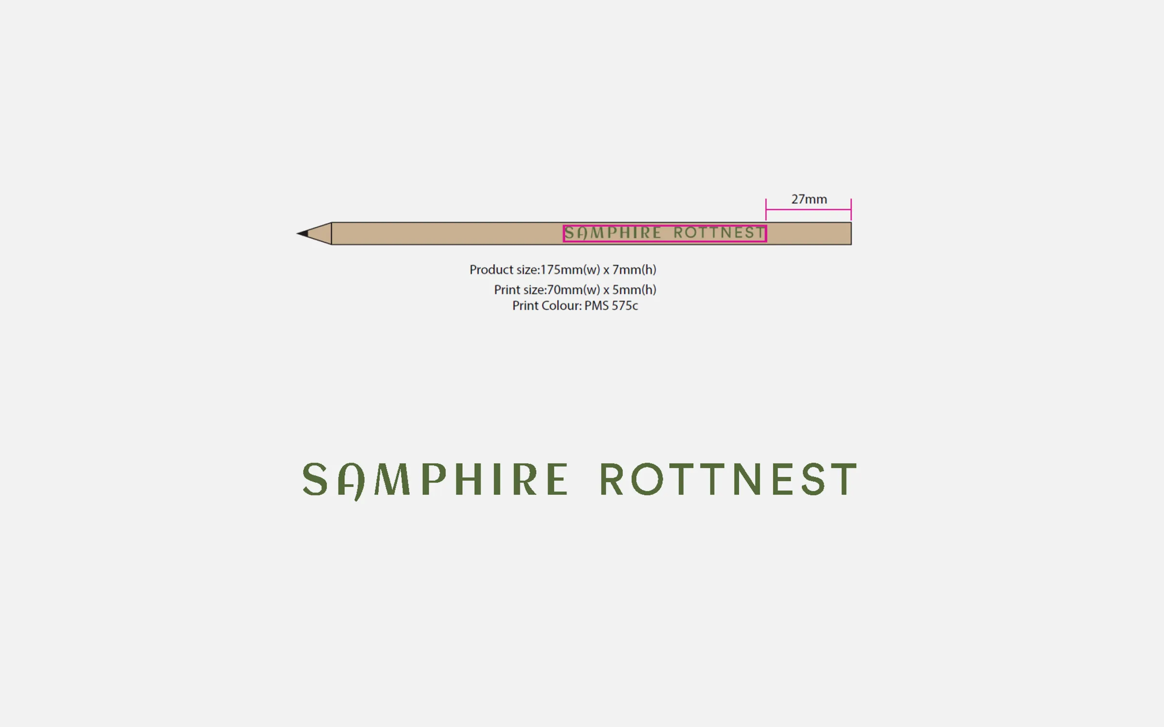
Pencil
- Item Code: PCRPSR – Round Pencil
- Size: Pencil - 175mm W x 7mm H
Brand - 70mm W x 5mm H
- Colour: Pencil - Natural wood finish
Brand - PMS 575
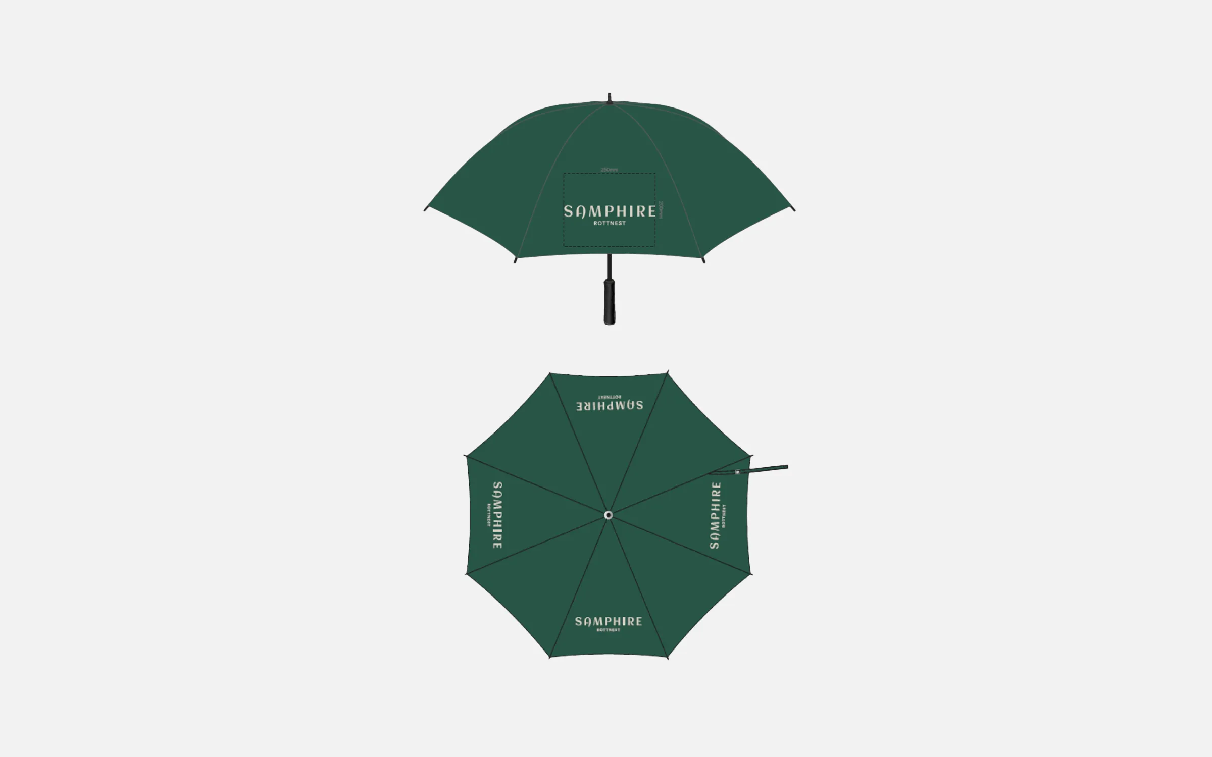
Umbrella
- Item Code: TRC200537 - PEROS Eagle Umbrella
- Size: Brand - 250mm W
- Colour: Umbrella - Bottle Green
Brand - Match ‘Limestone’
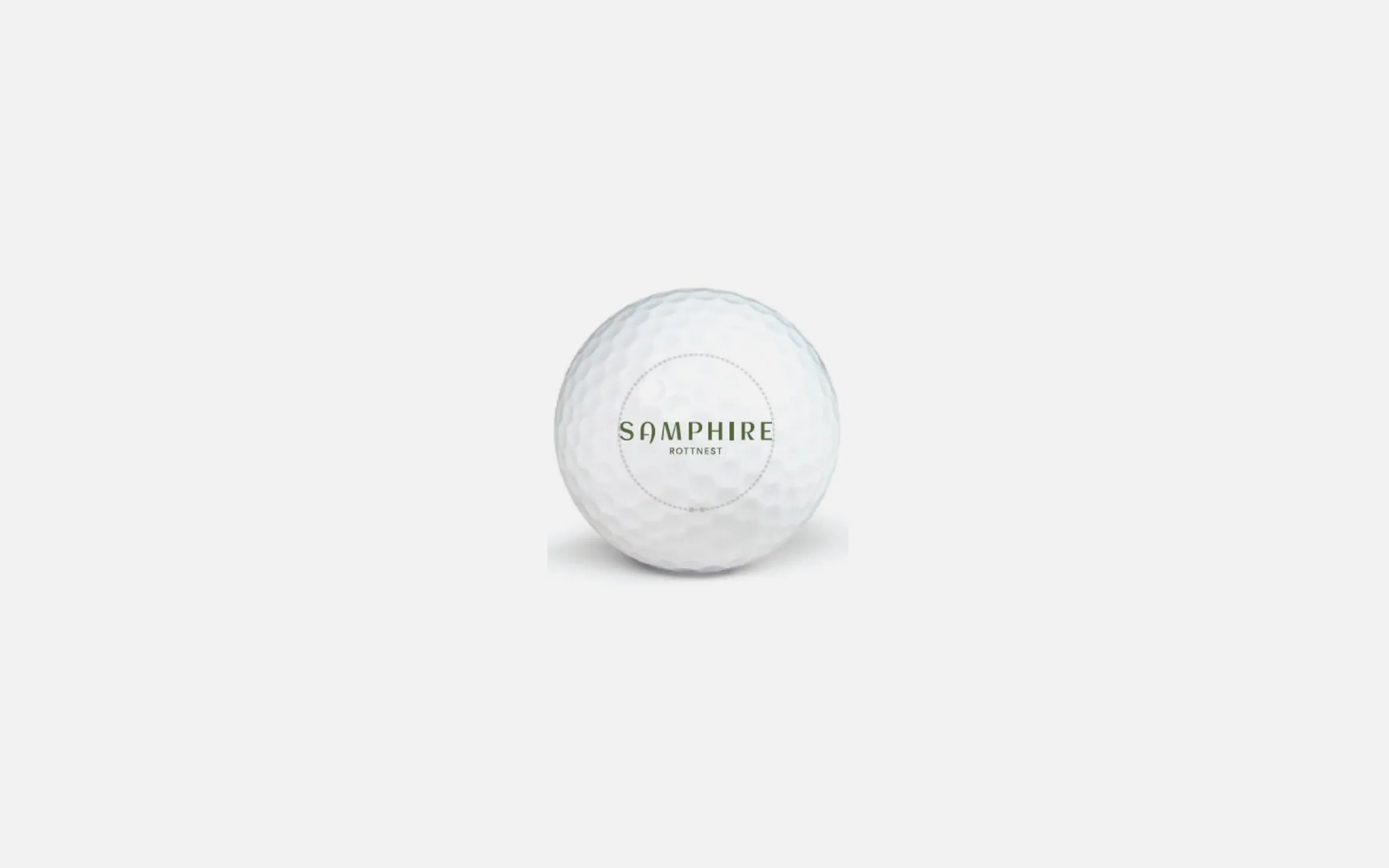
Golf Ball
- Item Code: TCGCGBC12SS3 – Callaway Super Soft Golf Ball
- Size: Golf Ball - 42.67mm
Brand - 23mm W
- Colour: Golf Ball - White
Brand - PMS 575
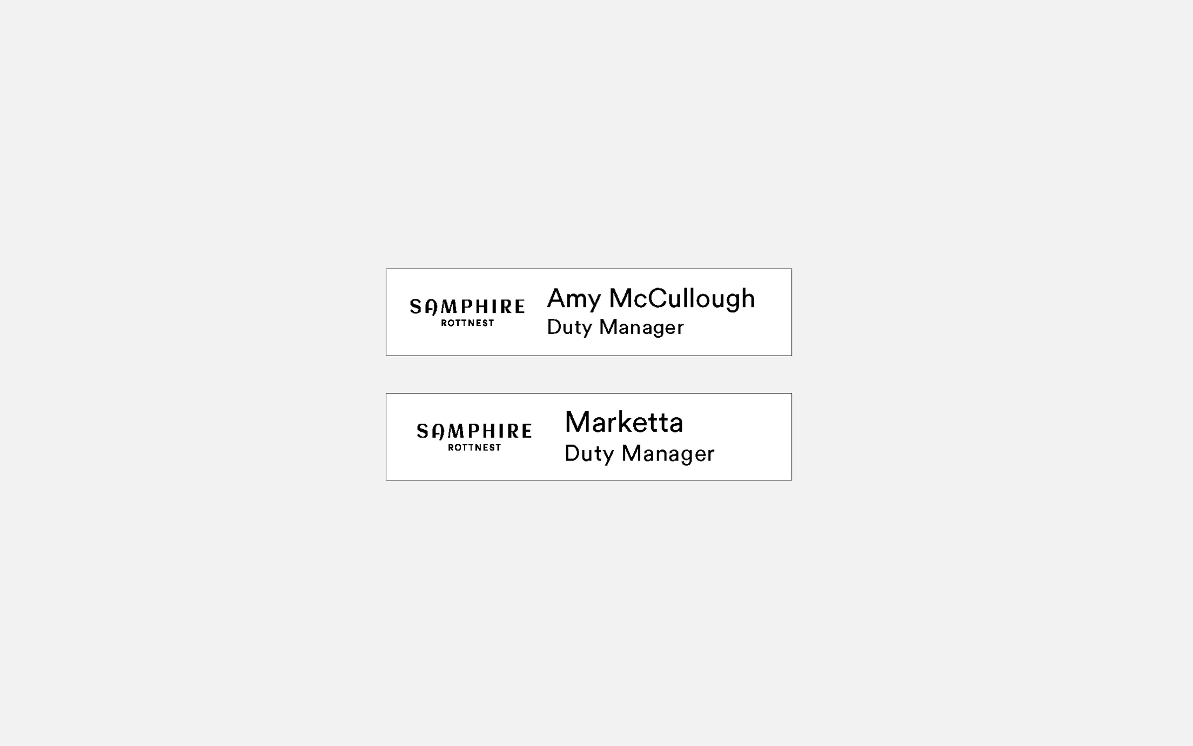
Key Card Holder
- Size: 90mmx55mm
- Stock: Calico Fabric
- Colour: Pantone 575
- Finishing: Production - Edith Cowan University
Screen printing - The Fabric Printer
Key Cards
- Title: 90mmx55mm
- Stock: Plastic Card Sock
- Colour: CMYK

Wooden plinth main entry
- Material: Frame - Shadowclad Natural Groove
Logo - Waterjet cut 8mm aluminium letters. - Fixing: Pin fixed to frame
- Colour: Frame - Driftwood/Weathered CED
Logo - Interpon GN297A Sable Bass
Wooden plinth side entry
- Material: Frame - Shadowclad Natural Groove
Logo - Waterjet cut 8mm aluminium letters. - Fixing: Pin fixed to frame
- Colour: Frame - Driftwood/Weathered CED
Logo - Interpon GN297A Sable Bass
Wooden plinth directional
- Material: Frame - Shadowclad Natural Groove
Logo - Waterjet cut 8mm aluminium letters. - Fixing: Pin fixed to frame
- Colour: Frame - Driftwood/Weathered CED
Text - Interpon GN297A Sable Bass
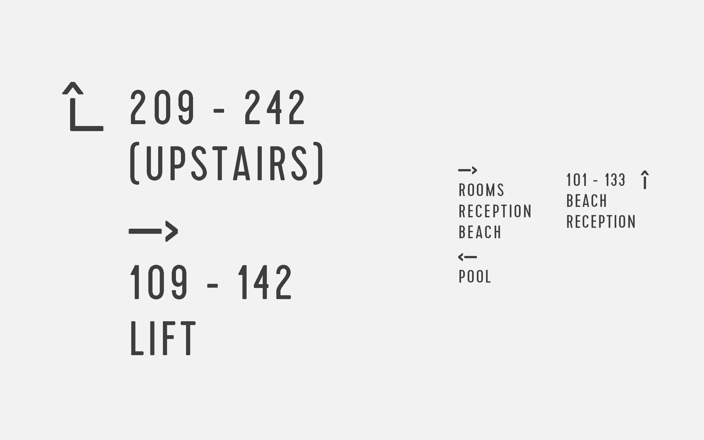
Directional frame
- Material: Frame - Aluminium
Letter ing - White Hi-tac vinyl - Fixing: Cement
- Colour: Frame - Interpon GN297A Sable Bass Texture Finish
Lettering - White Vinyl
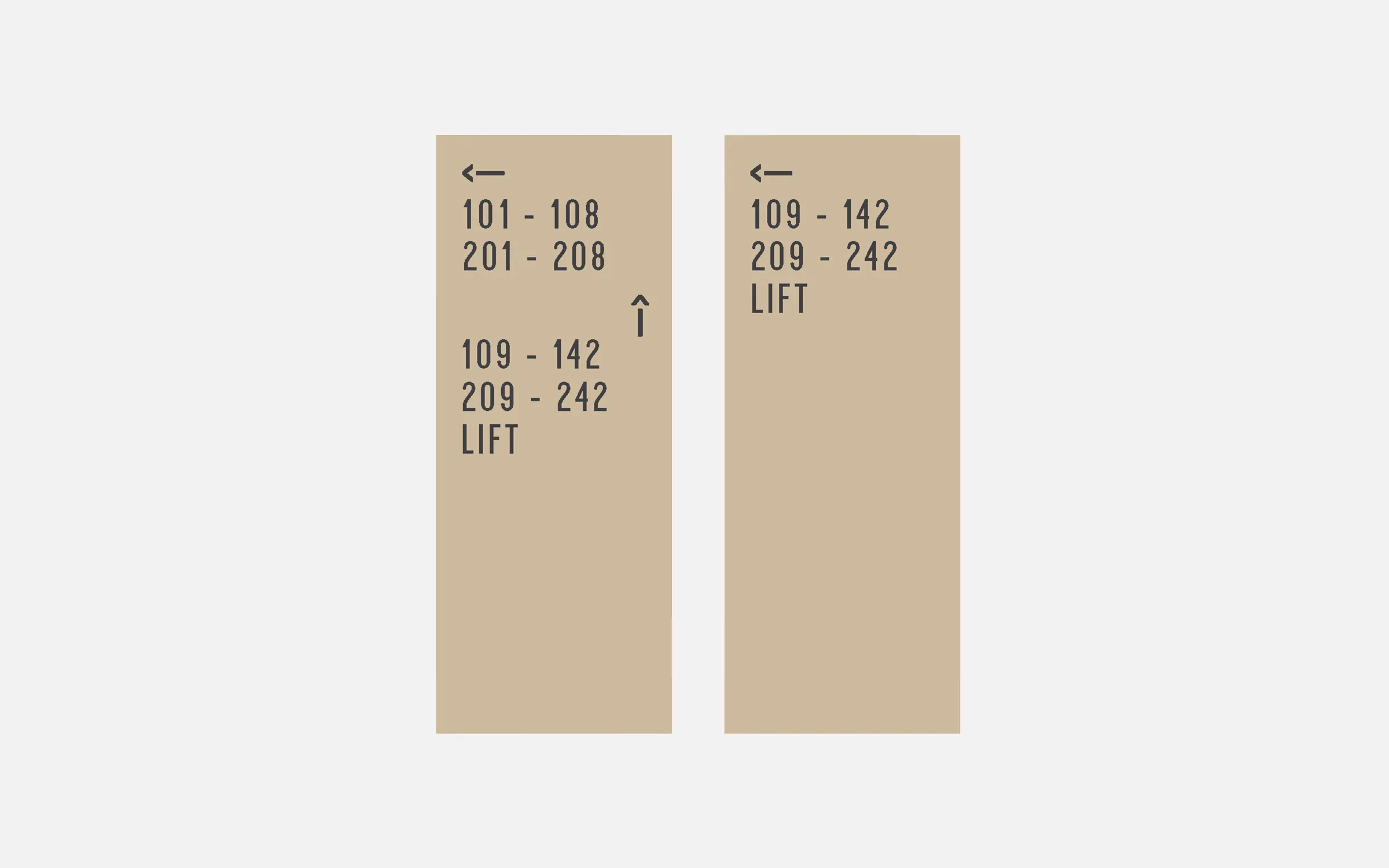
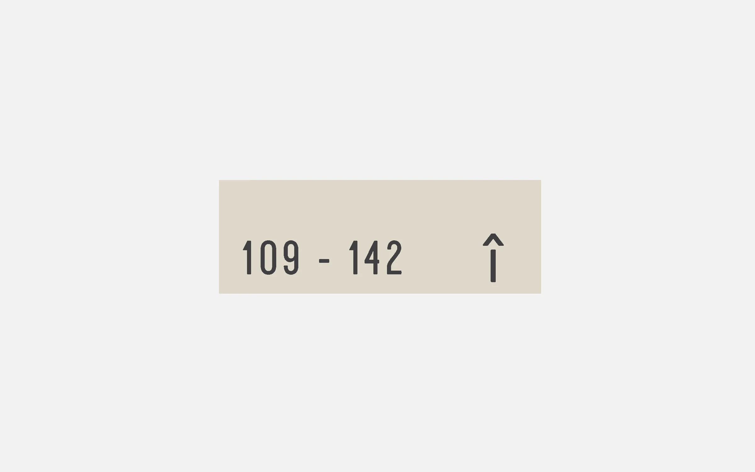
Room Numbers
- Material: Waterjet cut 8mm
aluminium numbers. - Fixing: Silicone Glued
- Colour: Interpon GN297A Sable Bass Texture Finish
Room names
- Material: Waterjet cut 8mm
aluminium letters. - Fixing: Silicone Glued
- Colour: Interpon GN297A Sable Bass Texture Finish
Directional blade
- Material: Aluminium with laser etched lettering
- Fixing: Silicone Glued
- Colour: Interpon GN297A Sable Bass Texture Finish Duralloy Paperbark 2723088S Satin Finish

Directional blade
- Material: Aluminium with laser etched lettering
- Fixing: Screw Fixing
Colour: Interpon GN297A Sable Bass Texture Finish Duralloy Paperbark 2723088S Satin Finish
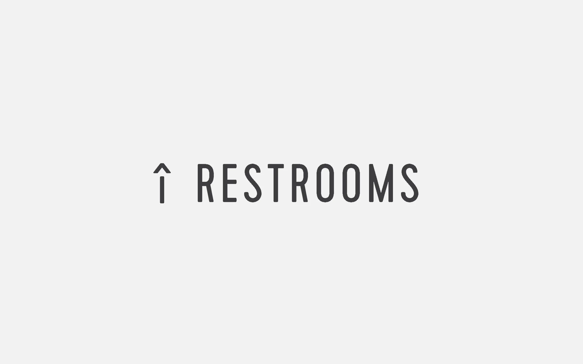
Restrooms
- Material: Waterjet cut 8mm
aluminium letters. - Fixing: Silicone Glued
- Colour: Interpon GN297A Sable Bass Texture Finish
Ice Machine
- Material: White Hi-Tac Vinyl cut out text
- Colour: Interpon GN297A Sable Bass Texture Finish

Painted Directional
- Material: Paint
- Colour: Match Interpon GN297A Sable Bass Texture Finish
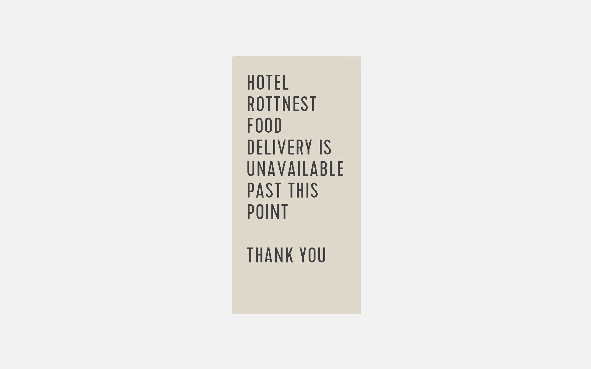
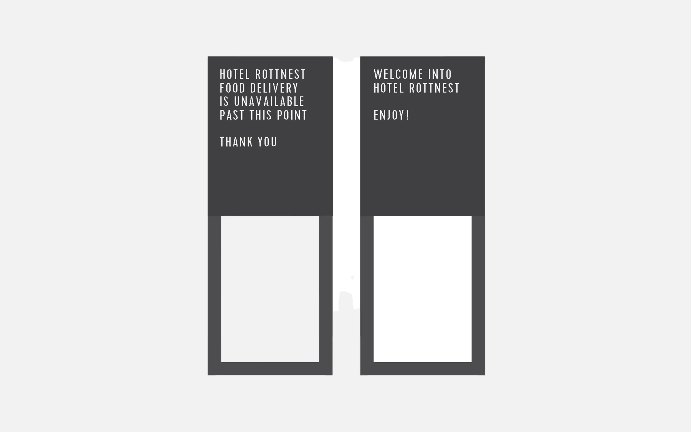
Hotel Rottnest food unavailable
- Material: Aluminium with laser etched lettering
- Fixing: Screw Fixing
- Colour: Interpon GN297A Sable Bass Texture Finish Duralloy Paperbark 2723088S Satin Finish
Gate Entry/Exit
- Material: Aluminium with laser etched lettering
- Fixing: Silicone Glued
- Colour: Interpon GN297A Sable Bass Texture Finish Duralloy Paperbark 2723088S Satin Finish
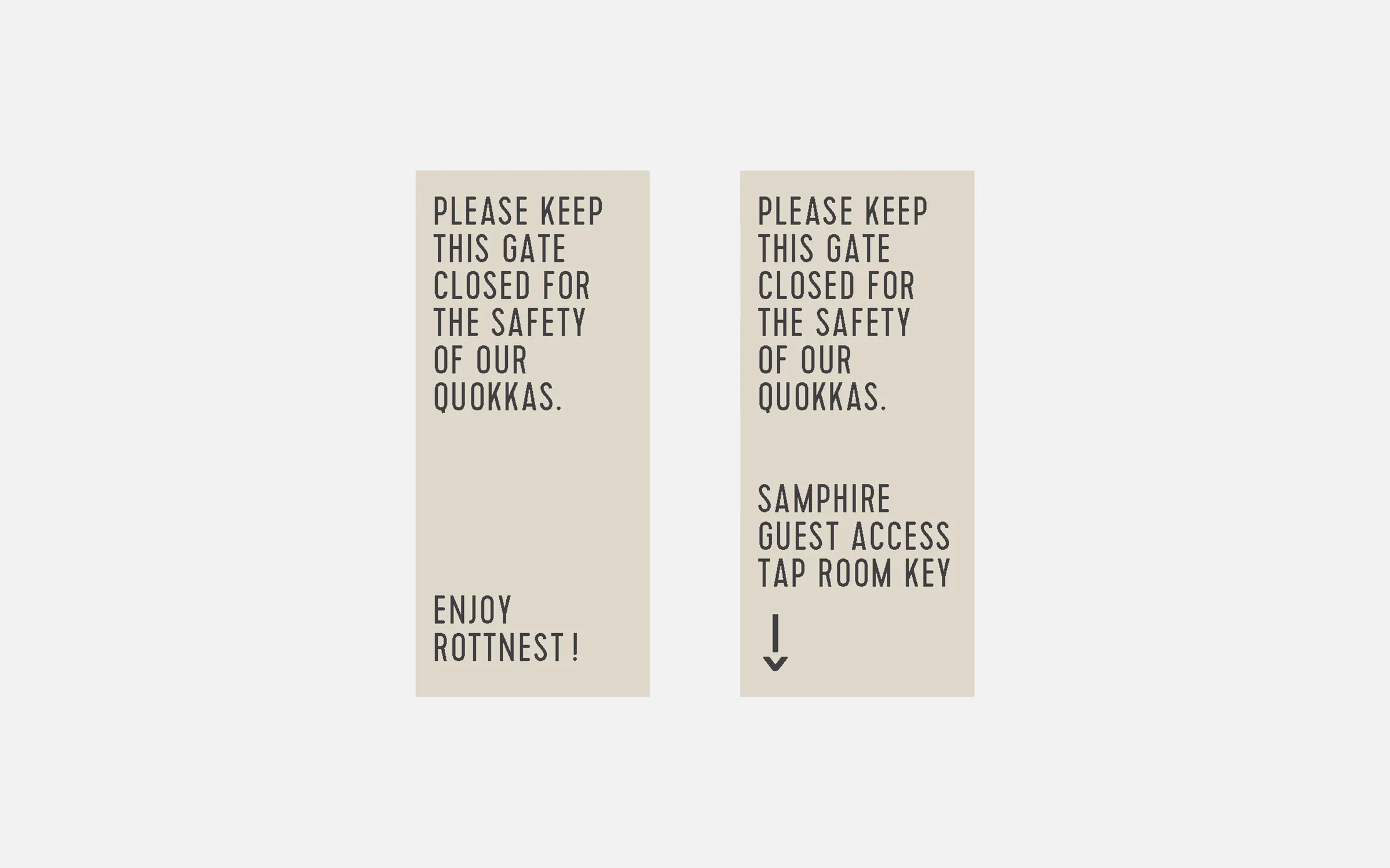
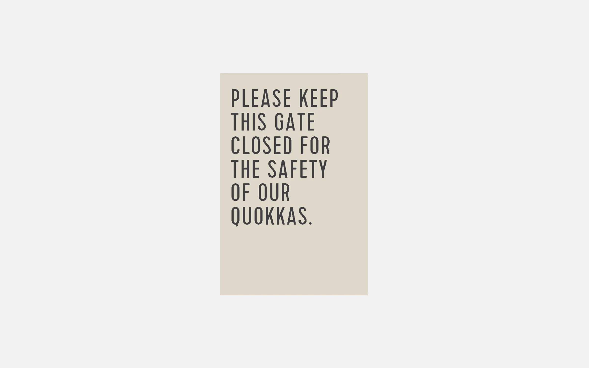
Please keep gate close
- Material: Aluminium with laser etched lettering
- Fixing: Silicone Glued
- Colour: Interpon GN297A Sable Bass Texture Finish Duralloy Paperbark 2723088S Satin Finish
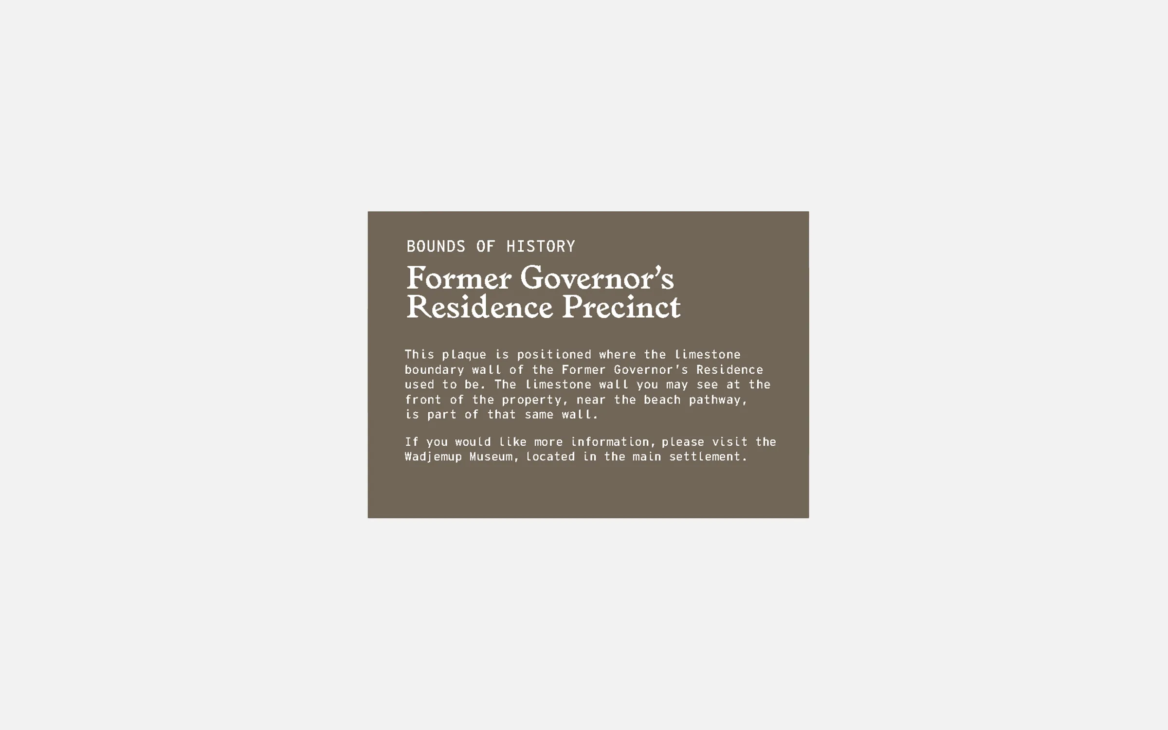
Interpretation signage square
- Material: Aluminium with laser etched lettering
- Fixing: Silicone Glued
- Colour: Frame - Printer To Advise
Lettering - Printer To Advise

Interpretation signage landscape
- Material: Aluminium with laser etched lettering
- Fixing: Silicone Glued
- Colour: Frame - Printer To Advise
Lettering - Printer To Advise
Interpretation signage landscape
- Material: Aluminium with laser etched lettering
- Fixing: Cement
- Colour: Frame - Printer To Advise
Lettering - Printer To Advise

Main Samphire Rottnest logo
- Material: Waterjet cut 10mm aluminium letters.
- Fixing: Pin fixed to wall
- Colour: Interpon GN297A Sable Bass Texture Finish
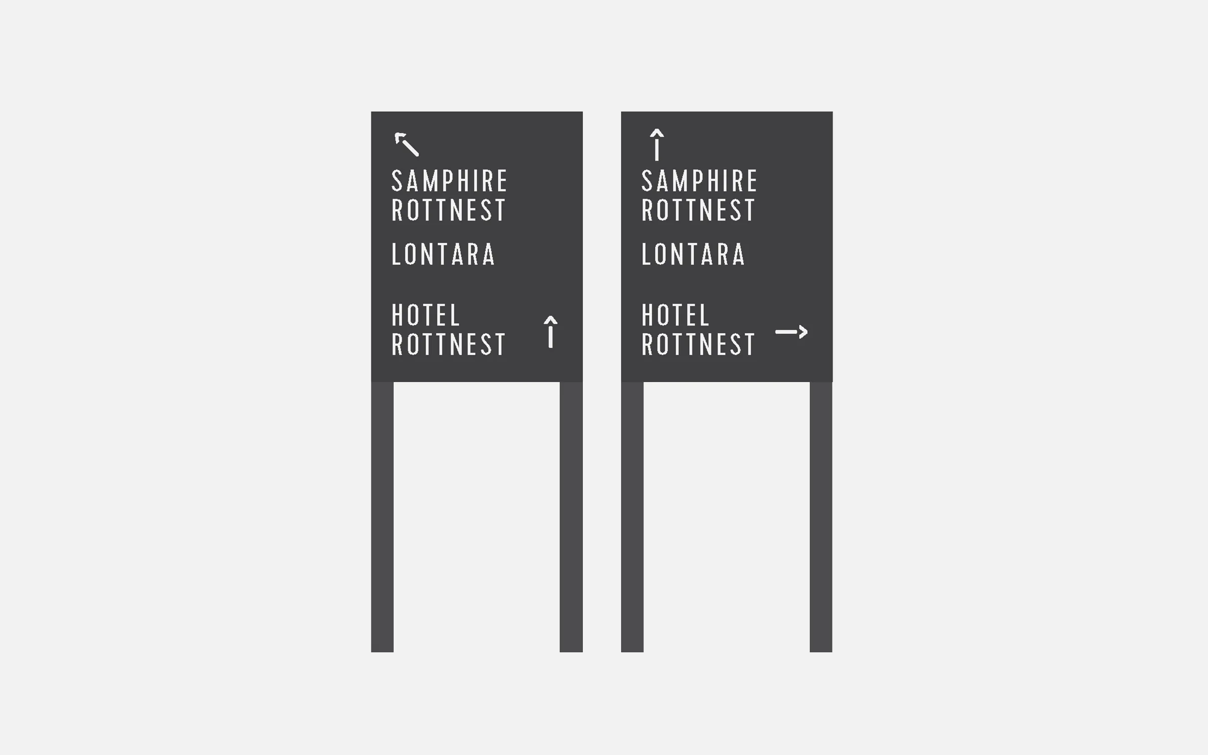
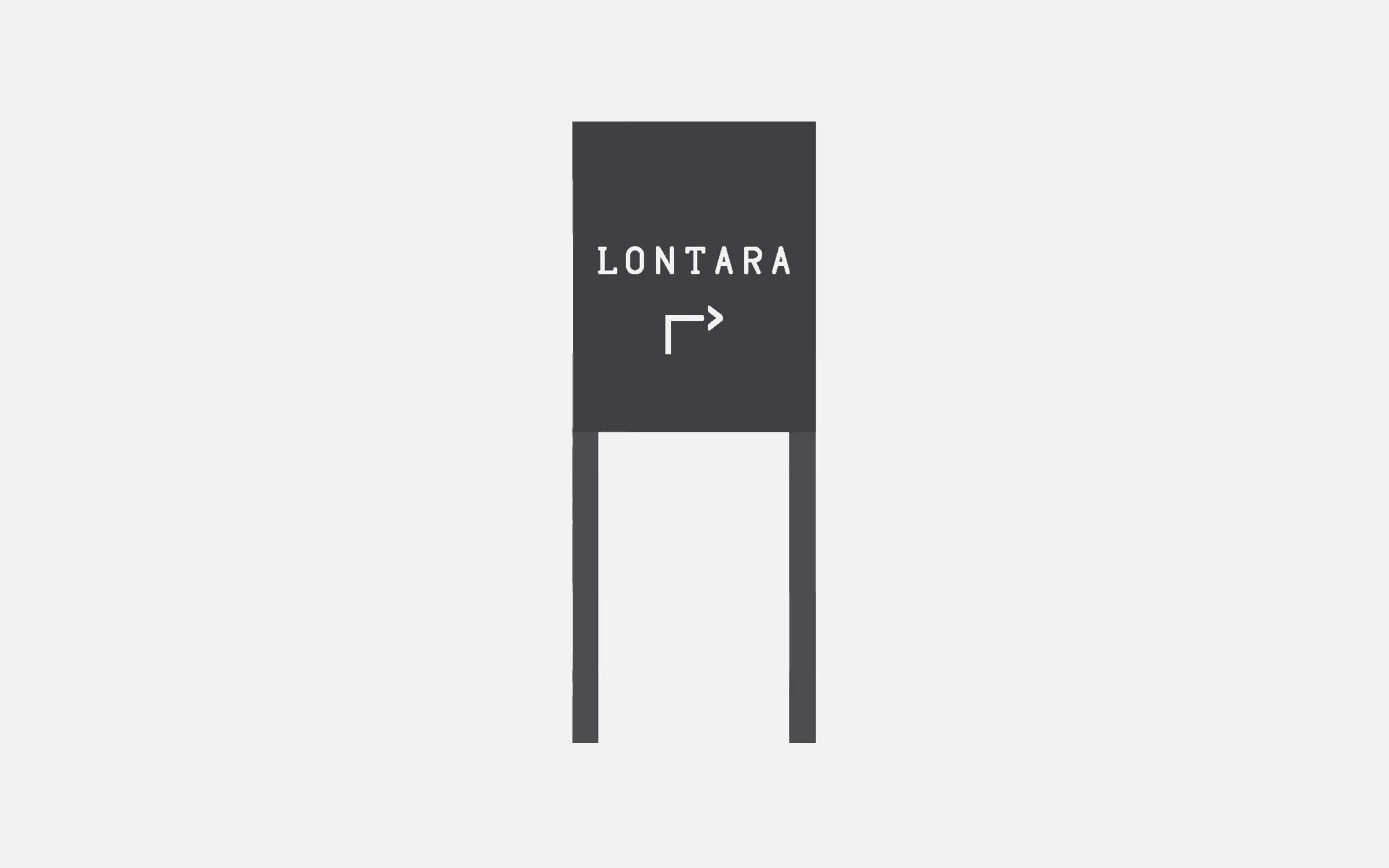
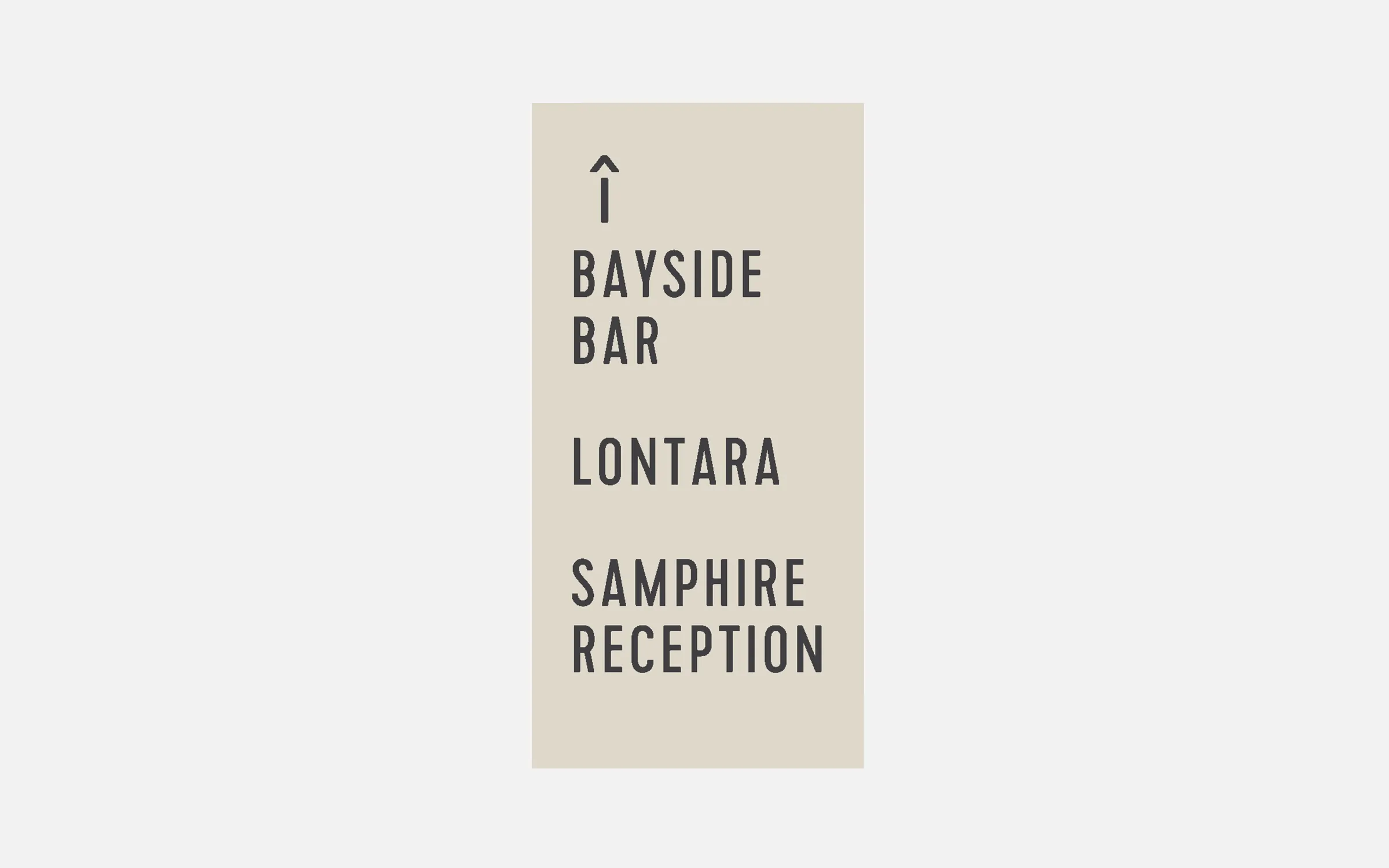
Lontara Directional Frame
- Material: Frame - Aluminium
Lettering - White Hi-Tac Vinyl
- Fixing: Cement
- Colour: Frame - Interpon GN297A Sable Bass Texture Finish
Lettering - White Vinyl
Lontara Main Entry
- Material: Waterjet cut 8mm aluminium letters.
- Fixing: Pin fixed to wall
- Colour: Printer to Advise
Pillar Directional
- Material: Aluminium with laser etched lettering
- Fixing: Screwed
- Colour: Interpon GN297A Sable Bass Texture Finish Duralloy Paperbark 2723088S Satin Finish
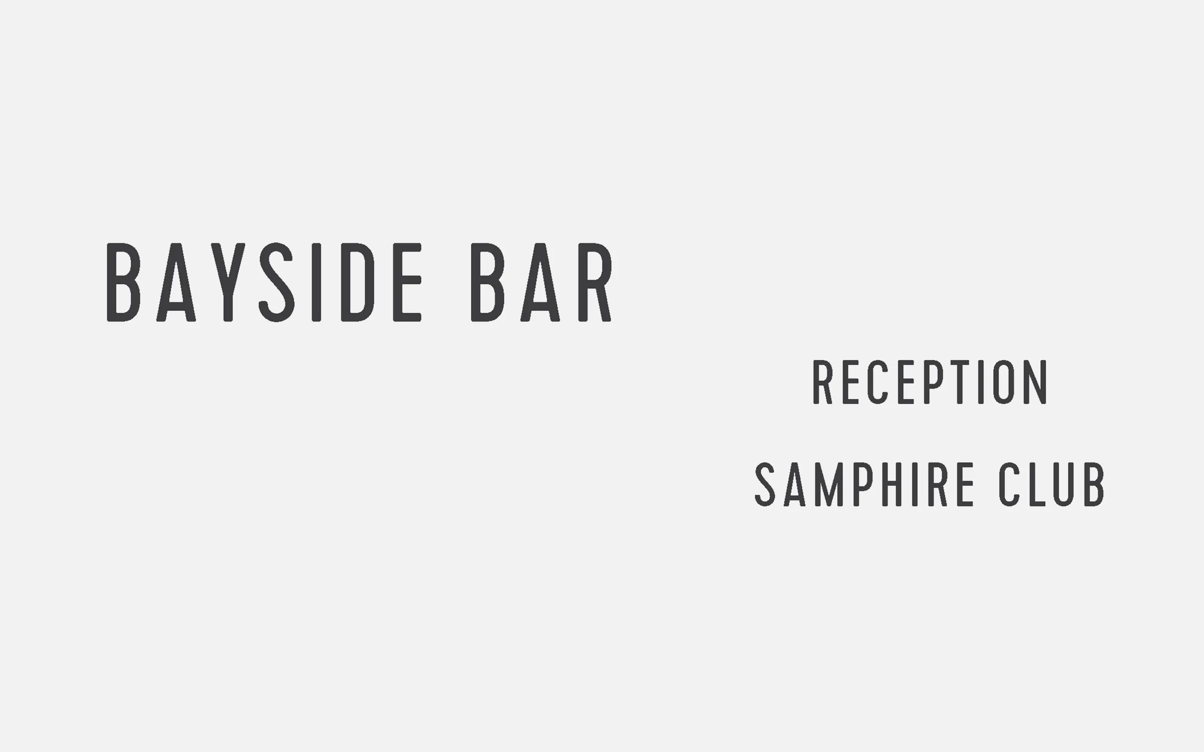
Samphire Club Swipe Card
- Material: Aluminium with laser etched lettering
- Fixing: Silicone Glued
- Colour: Interpon GN297A Sable Bass Texture Finish Duralloy Paperbark 2723088S Satin Finish

Samphire Club Fireplace Directional
- Material: Aluminium with laser etched lettering
- Fixing: Silicone Glued
- Colour: Interpon GN297A Sable Bass Texture Finish Duralloy Paperbark 2723088S Satin Finish

Lontara Directional frame
- Material: Frame - Aluminium
Lettering - Laser Etched - Colour: Frame - Duralloy Paperbark 2723088S Satin Finish
Lettering - Interpon GN297A Sable Bass
No lifeguard
- Material: Matte laminated digital prints on 3mm Signbond
- Fixing: Silicone Glued
- Colour: CMYK
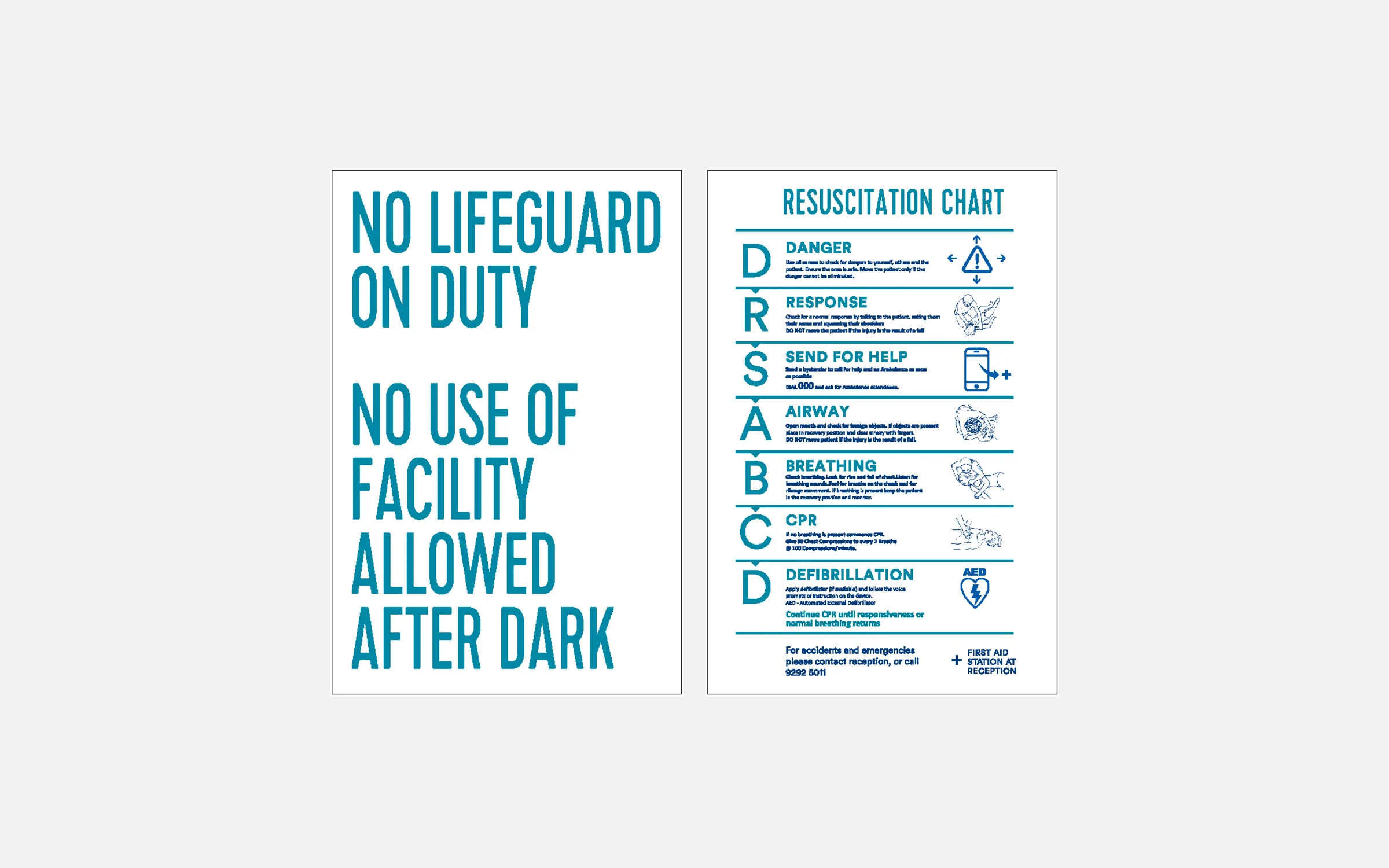
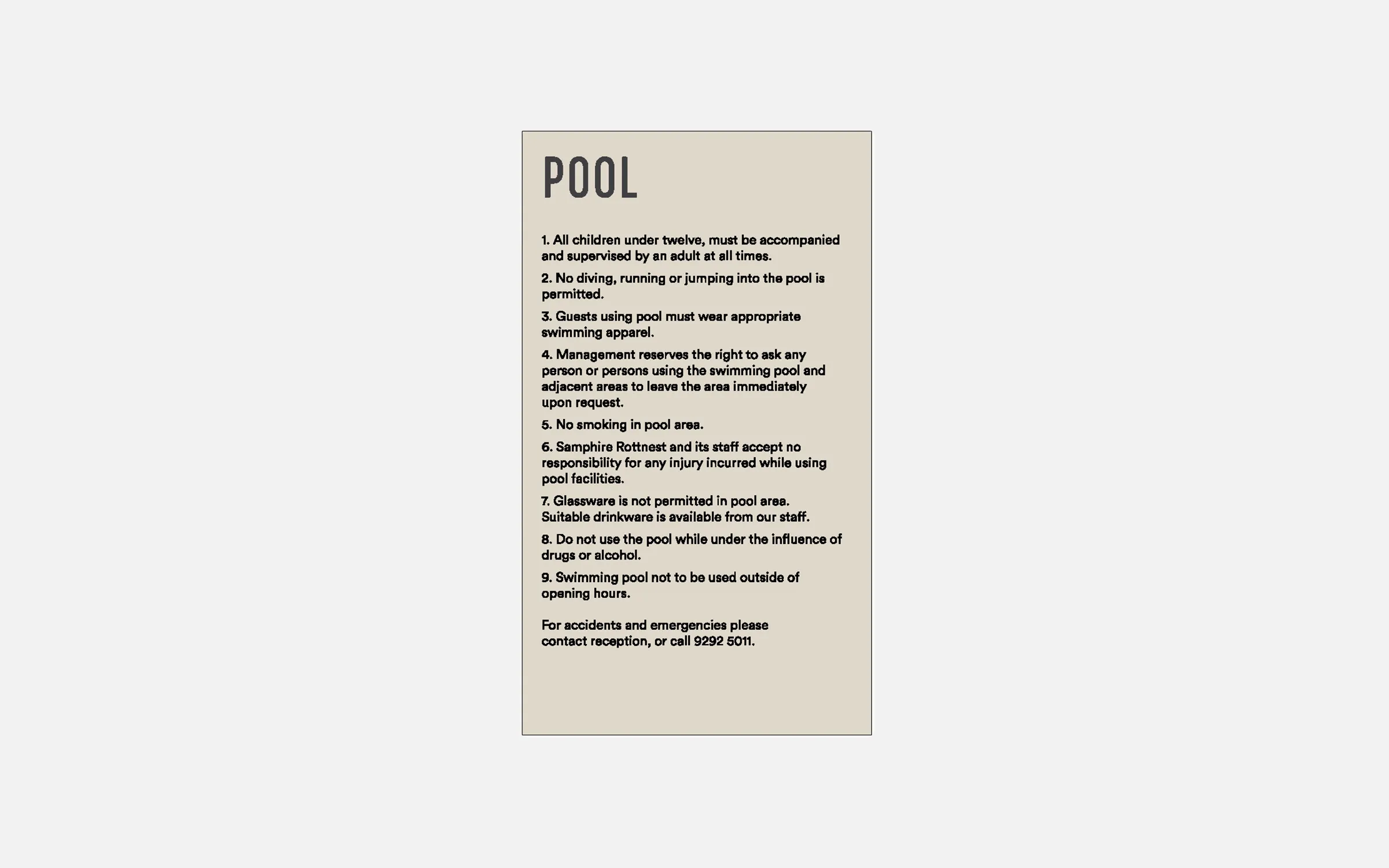
Pool Rules
- Material: Aluminium with laser etched lettering
- Fixing: Silicone Glued
- Colour: Interpon GN297A Sable Bass Texture Finish Duralloy Paperbark 2723088S Satin Finish Silicone Glued
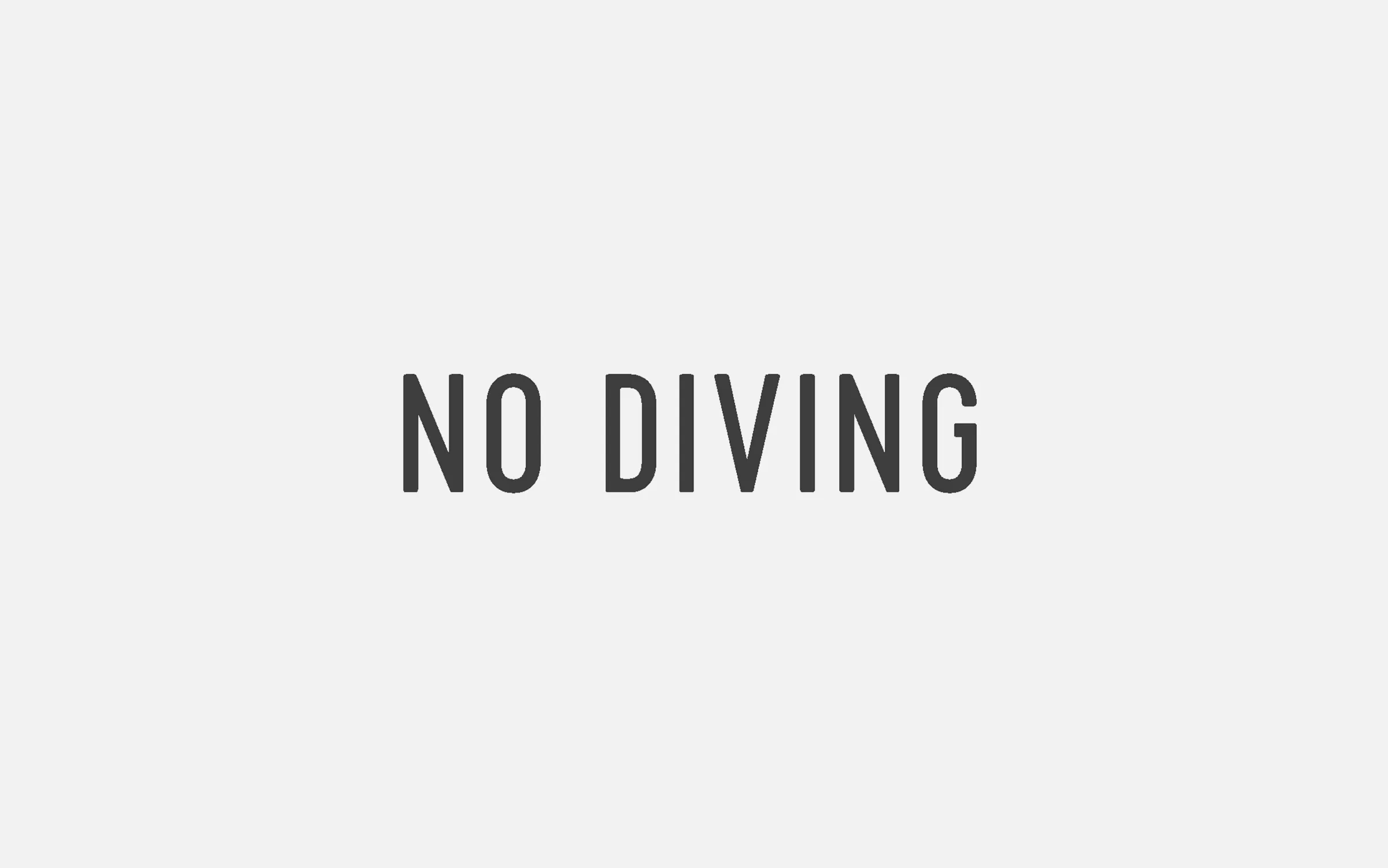
No Diving
- Material: White Hi-Tac Vinyl cut out text
- Colour: Interpon GN297A Sable Bass Texture Finish
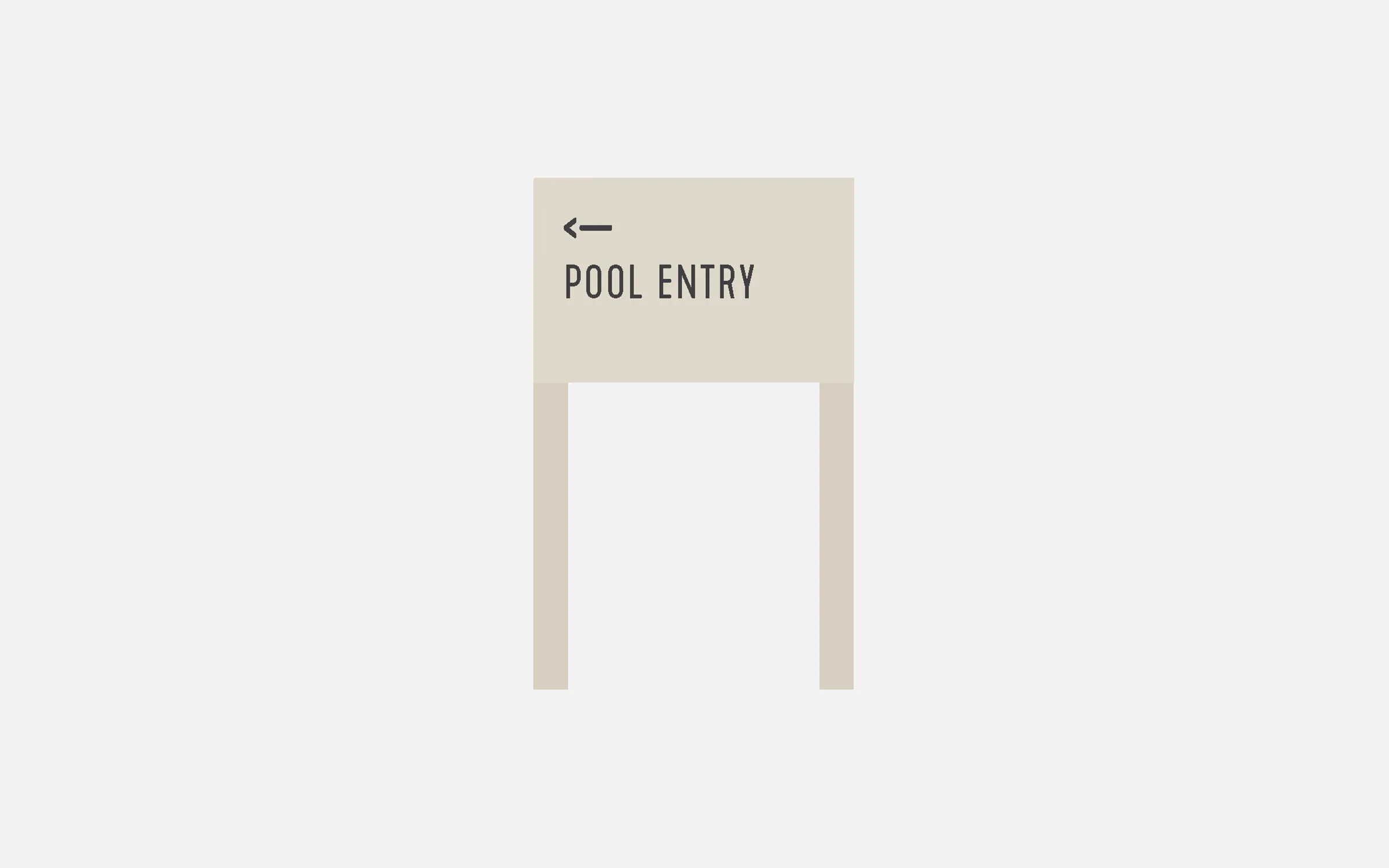
Pool Entry Directional
- Material: Frame - Aluminium
Lettering - Laser etched - Fixing: Concreted
- Colour: Frame - Duralloy Paperbark 2723088S Satin Finish
Lettering - Interpon GN297A Sable Bass
Bins
- Material: Aluminium with laser etched lettering
- Fixing: Silicone Glued
- Colour: Interpon GN297A Sable Bass Texture Finish Duralloy Paperbark 2723088S Satin Finish
- Finishing: Corner Return 48mm

No Food Delivery
- Material: Frame - Aluminium
Lettering - Aluminium with laser etched lettering - Fixing: Freestanding
- Colour: Frame - Interpon GN297A Sable Bass Texture Finish
Lettering - White
Beach Club Entry
- Material: Frame - Aluminium
Lettering - Matte laminated digital prints - Colour: Frame - Interpon GN297A Sable Bass Texture Finish
Lettering - White

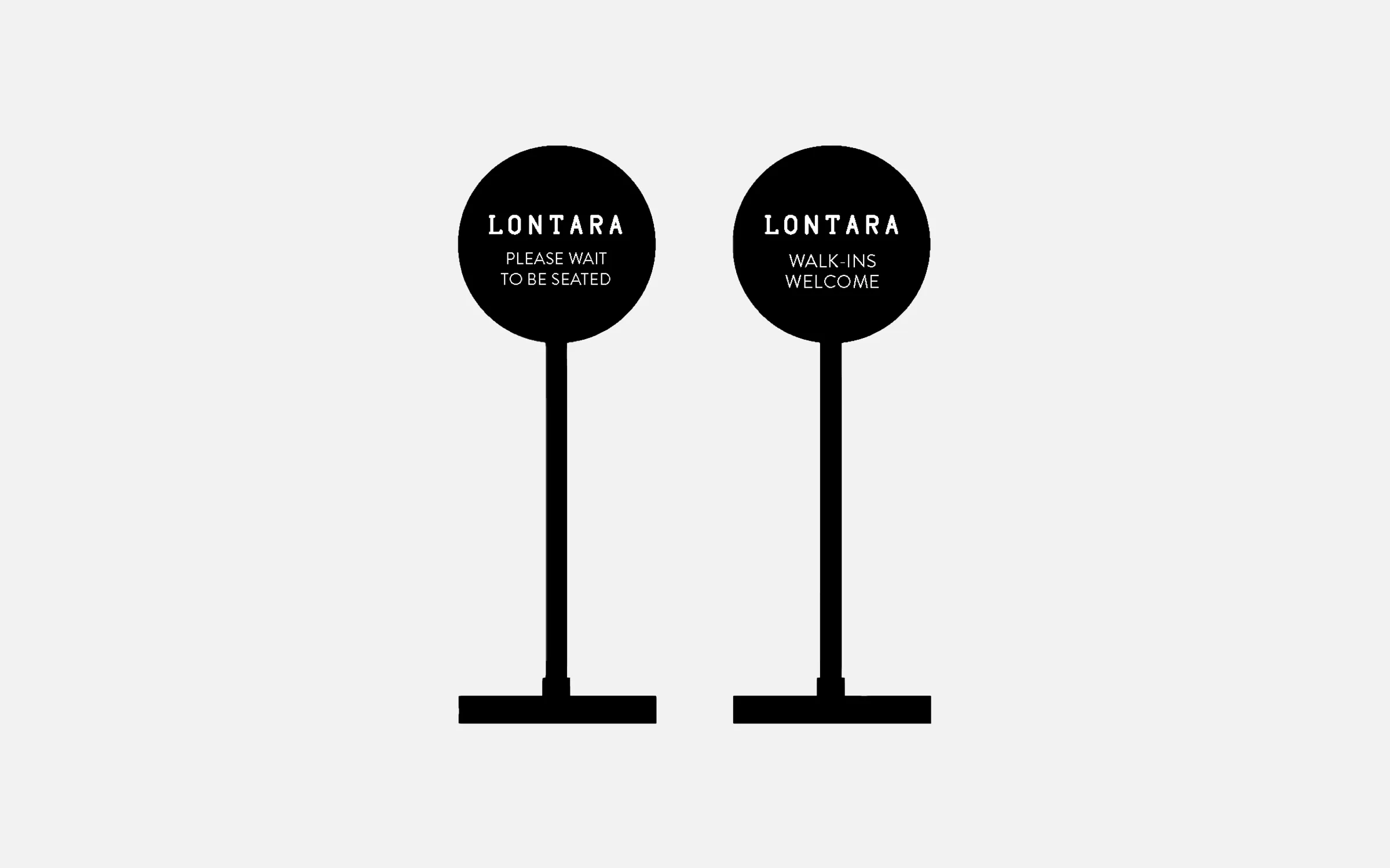
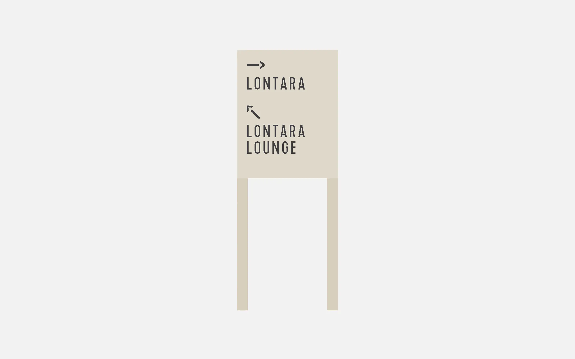
Lontara Standing Sign
- Material: Frame - Aluminium
Lettering - Hi-Tac Vinyl
- Colour: Frame - Black
Lettering - White - Contact: georgeandwilly.com